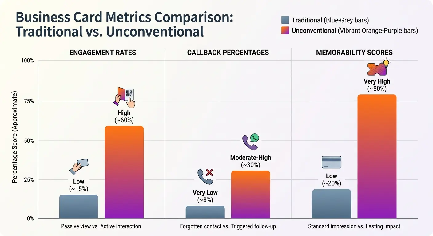
TL;DR
-
Your business card’s job isn’t listing credentials. It’s creating momentum toward the next conversation.
-
Most cards fail because they’re designed around what YOU want to say, not what THEY need to hear.
-
The cards that actually work? They break rules. Intentionally.
-
Follow-through cards embed actionable next steps directly into the design, reducing friction in your sales process.
-
Problem-solving cards address specific pain points your prospects face, making you immediately relevant instead of eventually forgettable.
-
If your card looks like everyone else’s, you’re relying 100% on your in-person charm. That’s a gamble.
-
Some of these approaches will feel risky. Good. That means you’re doing it right.
Cards That Reframe Your First Impression
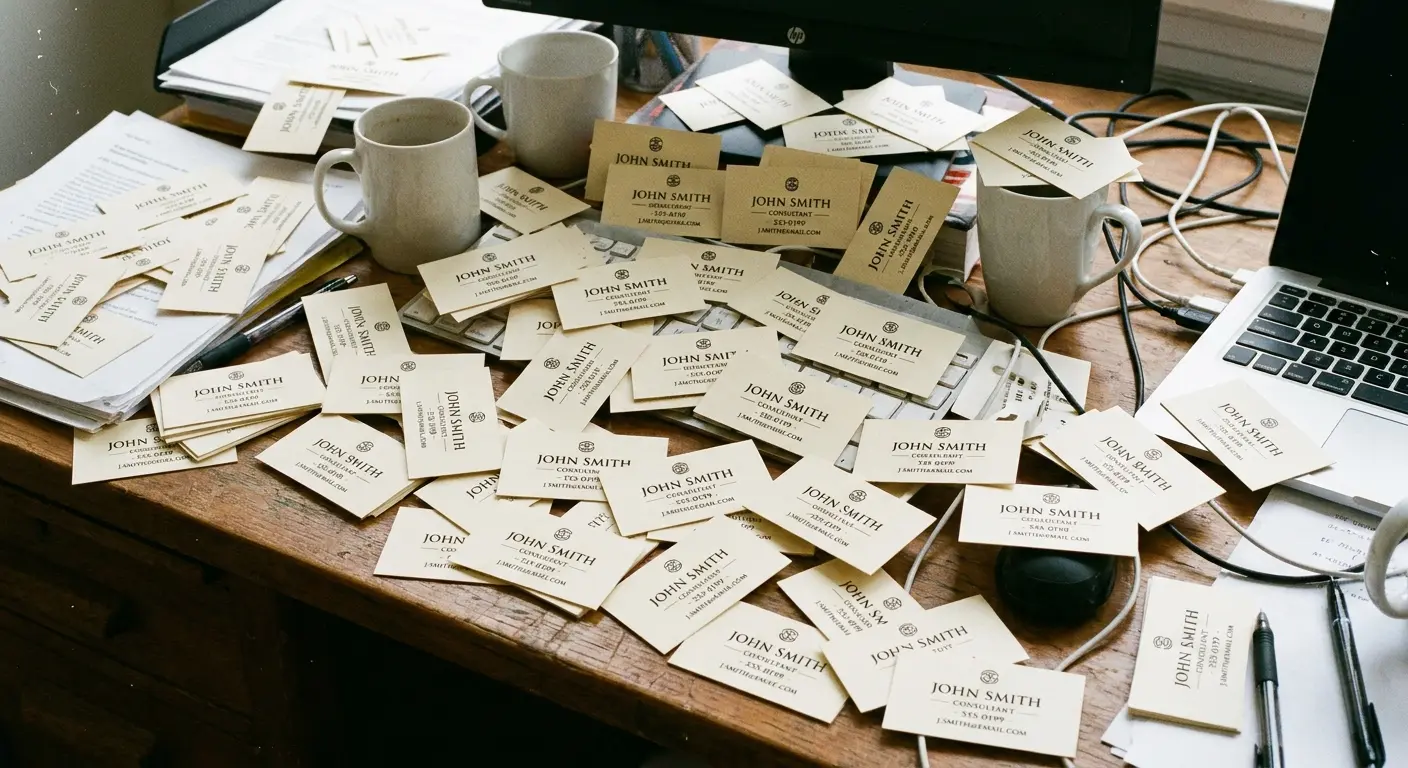
I watched a guy at a conference last month hand out 47 business cards in two hours. Standard white rectangle, black text, logo in the corner. His name, title, phone, email. The works.
Three months later, I’d bet money that not a single person called him.
Not because he was boring. Not because his cards were poorly printed. But because there was zero reason to keep his card versus the 46 other identical cards people collected that day.
Your first impression doesn’t need more information. It needs a reason to matter.
The problem with traditional business cards isn’t the quality of the paper stock or the font choice. It’s that they’re built around what you want to say rather than what the recipient needs to hear. Every element on a conventional card serves your organizational structure, not their decision-making process.
Here’s what standard elements communicate versus what you could be saying instead:
|
Traditional Card Element |
What It Actually Communicates |
Reframed Alternative |
|---|---|---|
|
Job Title |
Internal hierarchy position |
Problem you solve in plain language |
|
Company Logo |
Brand you work for |
Value proposition statement |
|
Full Address |
Physical office location |
QR code to portfolio or case studies |
|
Multiple Phone Numbers |
Ways to reach you |
Single action with clear next step |
|
List of Services |
Everything you offer |
Three specific problems you fix |
|
Social Media Icons |
Places you exist online |
One conversation starter question |
We’ve tested dozens of business card design variations with clients across industries. The ones that generate follow-up conversations share a common trait: they lead with relevance before credentials.
1. The Anti-Title Card
Strip away your job title entirely. Replace it with what you do in plain language.
Instead of “Chief Marketing Officer,” try “I help B2B companies stop wasting ad spend.”
Titles mean nothing to someone who just met you. They’re internal hierarchy signals that don’t translate outside your org chart. What does translate is clarity about the problem you solve.
I’ve had senior executives push back hard on this. “I spent 15 years earning this VP title. You want me to just… drop it?”
Yes. Exactly that.
Because the person holding your card doesn’t give a damn about your org chart. They need to know if you can help them, and “Vice President of Strategic Initiatives” tells them absolutely nothing useful. “I fix broken sales funnels for SaaS companies” tells them everything.
The shift feels risky. You’re trading status for clarity. That’s uncomfortable as hell if you spent a decade climbing to VP.
But cards that communicate value get kept. Cards with impressive titles? They get stacked with everyone else’s impressive titles and forgotten by Tuesday.
2. The Portfolio Preview
Turn the back of your card into a mini case study. One metric, one client result, one proof point.
“Increased demo requests 340% in 90 days” tells a story your name and phone number never will. You’re not just handing someone contact info. You’re giving them a reason to believe you can deliver.
The trick is keeping it specific enough to be believable but broad enough to apply to multiple prospects. Vague claims like “we drive results” get ignored. Concrete numbers get remembered.
We worked with a conversion optimization consultant who was struggling to differentiate herself at conferences. Everyone in her space claimed they could increase conversions. She added a single line to her business cards: “Last client: 287% increase in qualified leads, 8-week engagement.”
Three months later, nearly half the people who kept her card mentioned that specific stat when they reached out. It wasn’t the biggest number she’d ever achieved, but it was concrete and believable. That combination matters more than impressive-sounding generalities.
3. The Question Card
Lead with a single question your ideal client is already asking.
“Struggling to prove marketing ROI?” or “Tired of agencies that ghost you after the contract’s signed?” Position it prominently on the front, above your name.
Two things happen. First, it immediately signals relevance to the right people (and filters out the wrong ones). Second, it frames you as someone who understands their world before you’ve said a word about yourself.
Business cards online often default to templates that prioritize your information over their needs. Flip that. Make your card about them first. The question format creates an instant mental response. They’re either thinking “yes, that’s exactly my problem” or “no, that doesn’t apply to me.” Either way, you’ve created clarity about fit within seconds.
The best questions address frustrations, not aspirations. “Want to grow your business?” is too broad and obvious. “Spending $10K/month on ads with no idea what’s working?” hits a specific pain point that makes the right person immediately interested in what you have to say next.
4. The Credential Minimalist
List one credential. That’s it.
Not your MBA, three certifications, and association memberships. Pick the single most impressive or relevant qualifier and let it breathe. When you dilute your expertise across multiple credentials, you weaken all of them. When you spotlight one, it carries weight.
I’ve seen cards with six different certification logos, two degrees, and membership badges for three industry associations. The intent is to demonstrate comprehensive expertise. The effect is to create visual clutter that communicates insecurity.
Pick the one thing that matters most to your ideal client. If you’re selling to Fortune 500 companies, maybe it’s “Former VP of Marketing, Microsoft.” If you’re working with startups, maybe it’s “Advisor to 12 YC-backed companies.” One powerful credential beats five mediocre ones every time.
Restraint communicates confidence. It suggests you don’t need to prove yourself with a laundry list because your work speaks for itself.
5. The Conversation Starter
Add a single line that invites response.
“Ask me about the worst marketing advice I ever followed” or “I collect terrible taglines. Send me yours.”
It’s a small detail, but it gives the person holding your card a reason to reach out beyond “I should probably follow up with that person I met.” You’re creating a low-stakes entry point for conversation that doesn’t require them to have a project or budget ready.
The line needs to be specific enough to be interesting but open enough to apply broadly. “Ask me about growth hacking” is too vague and buzzy. “Ask me why I stopped using Facebook ads entirely” creates genuine curiosity.
We’ve found these conversation starters work best when they hint at contrarian thinking or unexpected experiences. People are drowning in conventional wisdom. Give them a reason to think you might have a different perspective worth hearing.
6. The Value Proposition Front-Load
Put your value prop where your company name usually goes.
“We turn website visitors into customers” gets top billing. Your company name goes smaller, secondary. Most business card orders follow the opposite hierarchy, which makes sense if you’re Nike or Apple.
You’re not.
Your brand recognition is still being built, so lead with the benefit, not the logo. When your card ends up in a stack on someone’s desk three weeks later, they might not remember your face or your company, but they’ll remember what you said you could do for them.
I’ve had clients push back on this hard. They’ve invested in building their brand, and now we’re suggesting they minimize it?
But here’s the reality: at the moment someone receives your card, your company name means nothing to them. What you do for clients is everything.
Once you’ve established the relationship and delivered results, your company name gains meaning and recognition. But on a first encounter, leading with “Acme Digital Solutions” tells them nothing. Leading with “We fix websites that don’t convert” tells them exactly why they should care.
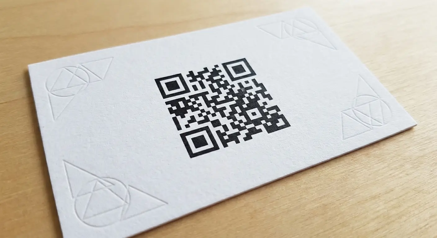
7. The QR-Only Gamble
Remove all contact details except a QR code that links to a landing page.
This is risky, but it works in specific contexts. If you’re in tech, design, or any field where being early on trends signals expertise, it positions you as forward-thinking. It also forces you to create a destination worth visiting, which means your business card becomes the entry point to a larger experience.
The downside? You’re betting that the person will scan it immediately (or remember to later). For conservative industries or older demographics, this might alienate more than it impresses.
Know your audience before you commit to custom business cards that require a smartphone to be useful. We’ve seen this approach work brilliantly for a UX designer whose QR code led to an interactive portfolio. We’ve also seen it fail spectacularly for a financial advisor whose target clients were 60+ executives who found the format confusing and off-putting.
If you’re going to do the QR-only card, you need high contrast. I’m talking 100% black on white or vice versa. I’ve seen designers try to be clever with dark gray QR codes on light gray backgrounds because it “looks more sophisticated.”
Doesn’t matter how sophisticated it looks if the scanner can’t read it.
Also, size matters. QR codes need to be at least 2cm x 2cm to scan reliably. Smaller than that and you’re gambling on phone camera quality.
Cards Built for Follow-Through
Handing someone a card is easy. Getting them to contact you is the hard part.
The gap between collecting a card and taking action is where most networking ROI dies. Someone meets you, finds you interesting, pockets your card with good intentions, and then gets back to their office where 47 other priorities immediately take precedence. Three weeks later, they find your card in a drawer and can’t quite remember why they kept it.
These formats solve that problem by making the next step so clear and low-friction that it happens before the moment passes.
8. The Appointment Scheduler
Include a Calendly link (or similar) with a specific call to action.
“Grab 15 minutes on my calendar: [short URL]” removes the back-and-forth email dance. You’re making it easier for them to say yes by eliminating the “when are you free?” friction.
When you order business cards with this feature, you’re essentially turning each one into a conversion tool, not just a contact repository. The URL needs to be short enough to type easily if someone doesn’t want to scan a QR code. We typically recommend a custom short domain (yourname.com/chat) rather than a generic Calendly link.
For service providers looking to streamline their client acquisition, learning strategies from our guide on how to evaluate a digital marketing agency can help you position your business cards as part of a larger conversion system.
The psychology here is straightforward: you’re removing the activation energy required to take the next step. Instead of “I should email this person sometime,” it becomes “I can book 15 minutes right now while I’m thinking about it.” That difference in friction determines whether your card generates conversations or gets filed away.
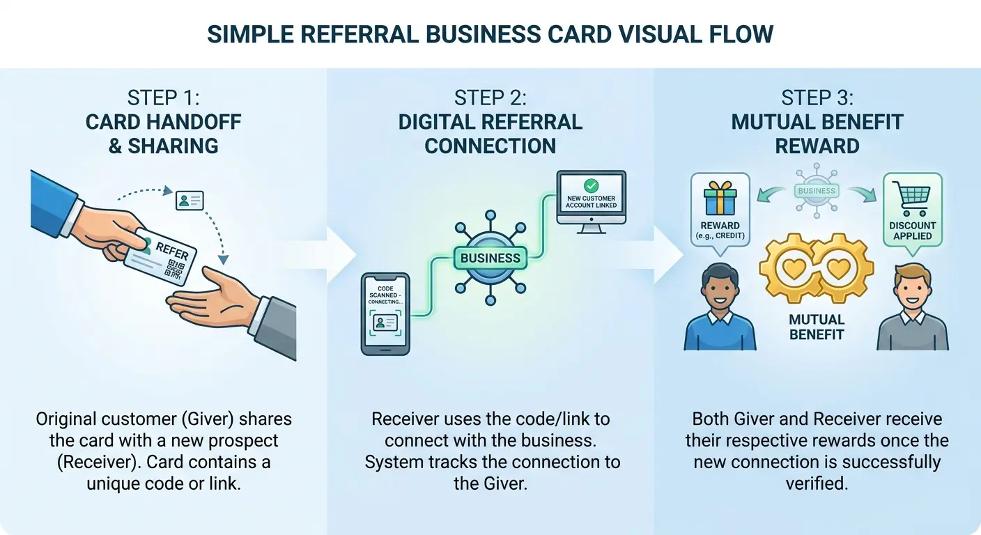
9. The Referral Incentive
Add a referral offer directly on the card.
“Give this to someone who needs [service]. If they hire us, you both get [specific benefit].” You’re turning every card you hand out into a potential referral engine.
Most people are willing to make introductions if there’s something in it for them (or the person they’re helping). By making the incentive explicit and easy to understand, you’re increasing the odds that your card gets passed along instead of filed away.
The benefit needs to be concrete and immediate, not some vague future discount. “You both save $500” is clear. “You both get preferred partner pricing” is meaningless.
We tested this with a client who does website audits. Their card said: “Know a business with a broken website? Give them this card. If they book an audit, you both get a free technical SEO report ($300 value).” In six months, they tracked 23 referrals directly from that card language. Before adding the incentive, they’d received maybe three referrals total in a year.
The specificity matters. People need to immediately understand what they get and what the person they’re referring gets. Complexity kills referrals.
10. The Multi-Contact Card
Design your card so it tears or perforates into two pieces.
One half has your info, the other half has a referral prompt or secondary contact.
The physical act of separation creates a moment of engagement that standard business cards don’t provide. When someone physically interacts with your card (tearing it, separating it), they’re more likely to remember it. The format itself becomes memorable because it’s different from the stack of standard rectangles they collected that day.
The downside is cost and complexity. Perforated cards require custom printing and typically cost more than standard formats. You need to decide whether the memorability justifies the investment for your specific business model.
I’ll be honest, though. The multi-contact perforated card seems brilliant in theory. In practice? It fails more often than it works, and I think I finally figured out why.
People don’t want to tear your card. It feels destructive. Even though that’s the whole point, there’s psychological resistance to ripping something someone just handed you. It feels rude.
The ones that work are the ones where the perforation is so obvious and easy that it barely counts as tearing. But most printers don’t get that detail right, so you end up with a card that requires actual effort to separate, and people just… don’t do it.
11. The Next-Step Nudge
Include a specific action item: “Text ‘AUDIT’ to [number] for a free website analysis” or “Email this card to yourself and I’ll send you our pricing guide.”
You’re giving them something to do right now while you’re still in front of them. The immediacy matters. If they wait until later, they probably won’t do it at all.
When you print business cards with this kind of prompt, you’re essentially building a lead capture mechanism into a physical object.
The action needs to be simple enough to complete in under 30 seconds. “Text this keyword” works. “Visit this URL and fill out a form” doesn’t. The lower the friction, the higher the completion rate.
One client, a brand strategist, added “Text BRAND to 555-0123 for our positioning worksheet” to her cards. She tracked an 18% completion rate. Meaning nearly one in five people who received her card took immediate action. That’s dramatically higher than typical business card follow-up rates, which hover around 2-3%.
12. The Resource Gateway
Turn your card into access to something valuable.
“Scan for our client-only resource library” or “Visit [URL] for templates we use with Fortune 500 clients.” You’re positioning the card as a key, not just a contact method.
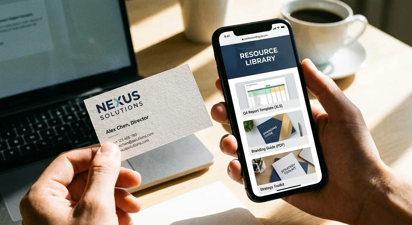
The resource needs to deliver real value, not just a disguised sales pitch. We’ve seen this fail when the “exclusive resource” turns out to be a thin PDF that’s clearly just lead generation bait. We’ve seen it succeed when the resource is something people would genuinely pay for: comprehensive templates, detailed guides, or tools that solve immediate problems.
A marketing consultant we worked with created a resource library with 15 campaign templates, budget calculators, and strategy frameworks. Her business cards promised access via a unique code. The result? People treated her card differently because it represented tangible value beyond contact information. Her close rate from networking events tripled.
13. The Limited-Time Offer
Add an expiration date to create urgency.
“Mention this card before [date] for [specific benefit].” This only works if the offer is genuinely valuable and the deadline is reasonable (30-90 days, not a week). You’re giving people a reason to act sooner rather than filing your card away indefinitely.
The scarcity thing is more complicated than it sounds. Yeah, deadlines create urgency. But if people don’t already want what you’re offering, a deadline just makes them feel pressured, which triggers resistance.
The deadline works when there’s already interest. It doesn’t CREATE interest. I’ve seen people misunderstand this and slap expiration dates on offers nobody wanted in the first place. Doesn’t help.
We’ve found the sweet spot is offering something that removes risk or adds value rather than just cutting price. “Mention this card for a free strategy session” works better than “Mention this card for 20% off.” The first attracts people interested in your expertise. The second attracts people interested in saving money.
The deadline needs to be visible but not dominate the design. We typically recommend printing it on the back or in smaller text, so the card doesn’t feel like a coupon. You want to maintain professional credibility while still creating urgency.
Cards That Solve Real Problems
The most effective business cards address a specific friction point in your sales process or your prospect’s decision-making journey.
They’re not about you. They’re about making the buyer’s life easier in some tangible way. When you design custom business cards around actual problems, you’re creating utility that extends beyond the initial handoff.
Every business has predictable objections, questions, or confusion points that come up repeatedly in sales conversations. These card formats address those issues proactively, moving prospects closer to a decision before you’ve even had a formal conversation.
|
Business Card Type |
Problem It Solves |
Best For |
Risk Factor |
|---|---|---|---|
|
Industry Translator |
Technical jargon confusion |
B2B sales to non-technical buyers |
Low |
|
Availability Matrix |
Unclear response expectations |
Service providers with varied schedules |
Low |
|
Pre-Qualifier |
Time wasted on unqualified leads |
High-ticket services or consultants |
Medium (may reduce total inquiries) |
|
Project Scope Snapshot |
“What exactly do you do?” confusion |
Multi-service businesses |
Low |
|
Decision-Maker Bypass |
Getting stuck with gatekeepers |
Enterprise or corporate sales |
Medium (requires tactful messaging) |
|
Pain Point Checklist |
Unclear relevance to prospect’s needs |
Complex solutions or niche services |
Low |
14. The Industry Translator
If you work in a technical field but sell to non-technical buyers, use your card to bridge that gap.
Include a simple visual or one-sentence explanation of what you do in terms they understand. “We make sure your website doesn’t break when 10,000 people visit at once” is clearer than “cloud infrastructure optimization.”
I’ve watched countless technical experts struggle with this. They’re so deep in their domain that they forget how opaque their language sounds to outsiders. A cybersecurity consultant kept losing deals because prospects didn’t understand what “penetration testing and vulnerability assessment” meant. We changed his business cards to say “I find the holes in your security before hackers do.” His booked consultation rate jumped 40%.
The translation needs to be accurate, not dumbed down. You’re not condescending to your audience. You’re removing unnecessary complexity that obscures your value.
15. The Availability Matrix
List your typical response times or availability windows.
“Email: 24-hour response” or “Phone: Best between 2-5pm EST.”
This seems minor, but it sets expectations and reduces frustration. People appreciate knowing when they’ll hear back or when it’s worth trying to reach you.
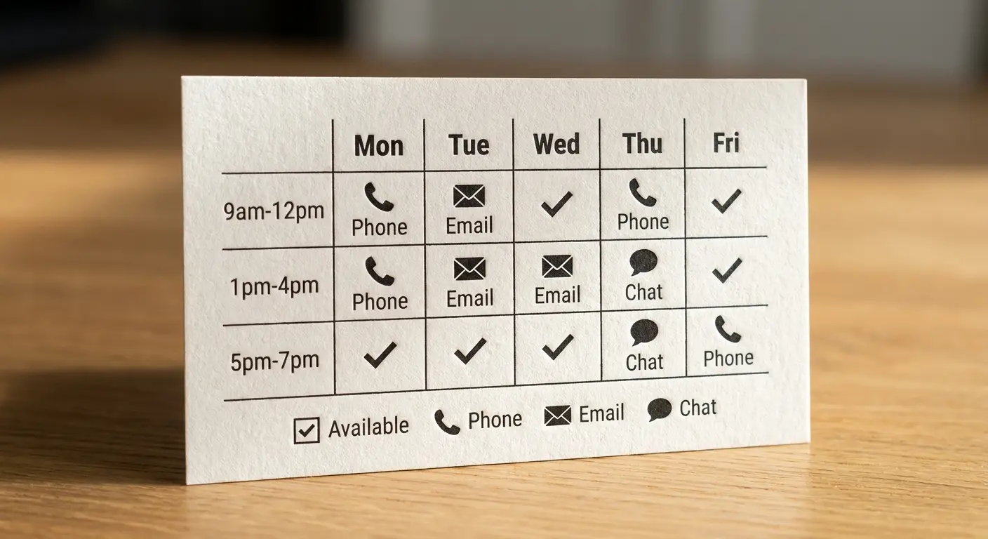
It also signals professionalism and organization. You’re not just handing them a phone number and hoping for the best. You’re giving them the context they need to connect with you successfully.
We implemented this with a consultant who was constantly getting frustrated voicemails from prospects calling at 9am when she was always with clients until noon. Adding “Best reached after 12pm EST” to her cards eliminated that friction entirely. Small detail, but it prevented dozens of missed connections.
Be honest about your actual availability, not aspirational. If you’re terrible at checking email, don’t promise 24-hour responses. If you’re in back-to-back meetings most mornings, say so. Setting accurate expectations builds trust.
16. The Pre-Qualifier
Include your starting price point or project minimum.
“Projects start at $5K” or “Minimum engagement: 3 months.” This filters out tire-kickers before they waste your time (or theirs). Yes, you might lose some potential conversations, but you’ll gain more qualified ones.
If someone pockets your card after seeing that number, they’re at least in the right ballpark. If they hand it back or don’t follow up, you just saved yourself a discovery call that was never going anywhere.
Professional business card design doesn’t have to be coy about money. Transparency builds trust. We’ve tested this extensively with clients in consulting, design, and professional services. The ones who were nervous about listing prices worried they’d scare people off. What happened instead: their inquiry quality went up dramatically while total inquiry volume dropped slightly. Net result? They closed more deals with less effort.
Similar to how agencies position themselves through transparent pricing, understanding how to start a marketing agency reveals why clear value communication on business cards matters from day one.
The price point you list should be your true minimum, not an artificially low number to get people in the door. Bait-and-switch tactics destroy trust faster than anything else.
17. The Project Scope Snapshot
List the three things you do best or the specific problems you solve.
Not a comprehensive service list. Three things, maximum. “Brand Strategy | Website Design | Content Systems.”
This helps people mentally categorize you and remember what to come to you for. It also prevents the “we do everything” problem that makes you forgettable. When someone needs one of those three things, your card becomes immediately relevant again.
We worked with a fractional CMO who kept getting inquiries for services she didn’t offer because her card listed “marketing services” without clarification. She narrowed it to three specific offerings: “Growth Strategy | Team Building | Marketing Operations.” Her qualified inquiry rate doubled because people understood exactly what she did.
The three items need to be distinct enough that they don’t blur together but related enough that they make sense coming from one provider. “SEO | PPC | Content Marketing” works. “Marketing | Consulting | Coaching” is too vague.
18. The Decision-Maker Bypass
If you typically need to reach someone above the person you’re talking to, design your card to facilitate that handoff.
“Pass this to your [CMO/CEO/Director] if [specific situation applies].” You’re acknowledging the reality that the person you met might not be the person who signs contracts, and you’re making it easy for them to make that introduction.
The phrasing needs to be tactful. You’re not dismissing the person in front of you. You’re helping them facilitate the right conversation.
A software sales rep we advised was constantly getting stuck at the manager level when she needed to reach VPs. We added a line to her cards: “If your team is struggling with [specific problem], this might be worth sharing with your VP of Operations.” It gave managers a script for making the introduction upward without feeling like they were being bypassed.
The “if [situation applies]” qualifier is critical. It prevents the card from feeling presumptuous while still creating a clear path to the actual decision-maker.
19. The Pain Point Checklist
List 3-5 common problems your ideal client faces as checkboxes.
“Struggling with: □ Low conversion rates □ High bounce rates □ Unclear messaging □ Inconsistent branding.”
Two things happen. First, it helps the person self-identify whether you’re relevant to them. Second, it gives them a tool to assess their own situation, which has value even if they don’t hire you immediately.
The checklist format is psychologically powerful because it creates a moment of self-assessment. People mentally check off which items apply to them, which creates a sense of urgency around the problems you solve.
We tested this format with a conversion optimization specialist. Her card listed six common website problems with checkboxes. Three months after a conference, she started getting calls from people who’d kept her card and recently encountered one of the listed problems. They’d check their desk, find her card, and realize she’d literally listed the exact issue they were facing.
The problems need to be specific enough to be recognizable but common enough that most prospects will identify with at least one. If none of the items resonate, the person probably isn’t your ideal client anyway.
Why This Matters for Your Actual Business
You’ve probably noticed that none of these approaches follow the standard business card template. That’s intentional.
The standard template assumes your goal is to convey information. But information is cheap and forgettable. What’s valuable is creating a reason to re-engage.
Every card you hand out is competing with dozens (or hundreds) of others for attention and follow-through. If yours looks and functions exactly like everyone else’s, you’re relying entirely on the strength of your in-person impression to carry you through. That’s a gamble.
We work with clients who’ve tried the conventional approach and watched their networking efforts produce minimal results. The problem isn’t usually the quality of their conversations. It’s that their business card doesn’t extend the value of that conversation beyond the initial handoff.
When we help companies redesign their cards around one of these frameworks, we’re not just updating their print materials. We’re rethinking how they capture and maintain attention in a world where attention is the scarcest resource.
The shift requires letting go of some deeply ingrained assumptions about what business card design should look like. Most people learned the format by copying what they saw others doing. But those others were copying someone else, who was copying someone else, going back decades to when business cards served a completely different function in a completely different business environment.
If you’re looking for physical cards that truly stand out, our guide on metal business cards make competition jealous explores premium materials that reinforce the strategic approaches outlined here.
Business card print quality matters, but strategy matters more. You can have the most beautifully printed card in the room, and if it doesn’t give people a reason to act, it’s just expensive paper. Conversely, a simple card with a clear next step and compelling value proposition will outperform elaborate designs that prioritize aesthetics over function.
Hot take: Premium card stock is mostly bullshit.
I know everyone says “invest in quality materials” and “thick cards feel more professional.” And yeah, there’s some truth there. But I’ve seen $20 batches of standard cards outperform $400 batches of triple-thick soft-touch laminated cards because the cheap ones had better strategy.
If you’re choosing between fancy materials and testing multiple strategic approaches, choose strategy every time. You can always upgrade the printing later.
The perforated card costs about 3x what standard cards cost. Maybe that’s worth it if your average client value is $50K+. If you’re selling $500 services? Probably not.
Standard cards run $20-50 for 500. Custom die-cuts, perforations, or specialty stocks? You’re looking at $150-400 for the same quantity. Do the math on your conversion rates before you commit.
If you’re tired of handing out cards that disappear into desk drawers, we should talk. The Marketing Agency specializes in turning standard marketing touchpoints into conversion tools. Book a free 30-minute consultation and we’ll walk through which of these approaches makes the most sense for your specific business model and sales process.
For businesses ready to elevate their entire brand presence beyond just business cards, exploring our top branding agencies guide can help you find partners who understand strategic differentiation.
Final Thoughts
Your business card isn’t a formality. It’s a tool.
When you treat it as such, when you design it around what happens after the handshake instead of during it, you create something that drives business forward.
I realize I just gave you 19 different options, which is probably 18 too many. If you’re feeling overwhelmed, you’re not alone.
Start with one. Literally just one. Pick the approach that solves your biggest current problem and ignore the rest.
Maybe you’re not ready to go full QR-only or strip away your job title entirely. Fine. Add a pain point checklist to the back of an otherwise standard card. Include your Calendly link. List your project minimum. Pick one element that addresses a real problem in your current networking or sales process.
Test it. See what happens. Adjust based on actual results, not assumptions about what people expect.
If you’re a solo consultant reading this: Start with the anti-title card or the question card. Simple, cheap, effective.
If you’re a marketing director at a mid-size company: The portfolio preview or project scope snapshot probably makes more sense. You need to communicate team capabilities, not just personal brand.
If you’re a sales rep: The appointment scheduler or next-step nudge. You need conversion tools, not branding exercises.
Whether you’re designing business cards or building comprehensive marketing systems, understanding scalable campaign development ensures every touchpoint works harder for your business growth.
Look, maybe I’m wrong about half of this. Maybe your industry is different. Maybe your clients would think a QR-only card is pretentious nonsense.
Test it anyway.
The worst that happens? You waste $50 on a batch of experimental cards that don’t work. The best that happens? You finally get follow-up from networking events that actually leads somewhere.
I know which bet I’d take.