
Table of Contents
-
Why Most People Build Pivot Tables Backwards
-
The Pre-Pivot Audit: What Your Data Actually Needs Before You Touch a Pivot Table
-
Building Your First Pivot Table (With Intent, Not Muscle Memory)
-
The Hidden Filters That Make or Break Your Analysis
-
Calculated Fields: Where Pivot Tables Go From Useful to Indispensable
-
Formatting That Actually Communicates (Not Just Decorates)
-
The Refresh Problem Everyone Ignores Until It’s Too Late
-
When to Walk Away From Pivot Tables Entirely
TL;DR
-
Start with your question, not your data (I know, sounds backwards)
-
Your data structure determines 80% of whether this works. Most people start building before they clean anything.
-
Calculated fields are where the magic happens, but the syntax is weird and works differently than regular Excel formulas
-
Filters and slicers aren’t the same thing, and picking wrong will confuse everyone who touches your file
-
Pivot tables lie to you when source data changes. No error message. Just wrong numbers.
-
Some questions genuinely don’t belong in pivot tables. Forcing them creates more work than building something else.
Why Most People Build Pivot Tables Backwards
I’ve built hundreds of pivot tables the lazy way. Click Insert, drag whatever fields look relevant, fiddle until something appears that might answer my question. Takes five minutes. Gets ignored by next Tuesday.
The problem isn’t that this method doesn’t work (it does). The problem is you end up answering “what can I easily show with this data?” instead of “what do I actually need to know?” Those are different questions. The gap between them is where most Excel reports go to die in someone’s downloads folder.
Research shows that PivotTables can transform raw data into meaningful insights and reports in minutes, yet most users approach them without a clear analytical framework. This speed advantage becomes a liability when you haven’t defined what you’re trying to figure out.

The overlooked angle here isn’t about pivot table mechanics. It’s about the decision architecture that should happen before you ever click Insert. What specific decision will this analysis inform? Who needs to act on it? What threshold or pattern would change someone’s behavior?
I’m not suggesting you need a formal requirements document for every pivot table. But spending two minutes writing down the question you’re trying to answer will save you from rebuilding the same table three times because stakeholders keep saying “that’s interesting, but what I really meant was…”
The Question Framework That Changes Everything
Start with the end state. What does someone do differently after seeing your pivot table in Excel? If the answer is “nothing, it’s just for awareness,” you might not need the pivot table at all (or you need to dig deeper into what “awareness” actually means).
Write down your question in plain language. “How much did we spend on marketing last quarter?” is clear. “What’s our marketing performance?” is not, because performance could mean spend, ROI, lead volume, conversion rates, or a dozen other metrics.
Before you build anything, write down:
-
What question am I answering? (Be specific. “Marketing performance” isn’t a question)
-
What will someone do differently after seeing this?
-
Who’s actually going to read this?
-
What number or pattern would make them act?
-
Which data columns directly answer my question?
-
What date range matters?
-
How often does this need updating?
The specificity of your question determines which fields belong in your pivot table and which ones create noise. Every field you add creates cognitive load for whoever reads your report.
The Stakeholder Translation Step
Different people need different levels of detail, but most pivot tables try to serve everyone and end up serving no one particularly well. Your executive sponsor probably wants three numbers and a trend. Your operations manager needs the granular breakdown by category, region, and time period.
Had a sales director once who built a pivot table with 47 columns. Forty-seven. You needed to scroll sideways through three screen-widths to see everything. When I asked what question she was trying to answer, she said “all of them.” That’s not how this works.
After rebuilding for specific audiences, she created three separate tables: one showing only total revenue by product line for executives, one with regional breakdowns for territory managers, and one with individual rep performance for sales leadership. Each table took three minutes to build and actually got used in decision-making.
You can build both views from the same source data, but they shouldn’t be the same pivot table. Trying to make one pivot table work for multiple audiences is like trying to make one presentation work for both executives and engineers. Technically possible. Actually useful to nobody.
Decide who the primary audience is. Build for them. Everyone else can get their own pivot table.
The Pre-Pivot Audit: What Your Data Actually Needs Before You Touch a Pivot Table
Your data structure will sabotage your pivot table before you even start building. I’ve wasted entire afternoons trying to make a pivot table work with data that’s organized wrong for what I’m trying to accomplish.
The single biggest issue? Data stored in a format that’s easy to read but impossible to analyze. You know the type: merged cells, subtotals baked into the data range, column headers that span multiple rows, blank rows separating sections. It looks great in a printed report. It breaks everything in a pivot table.
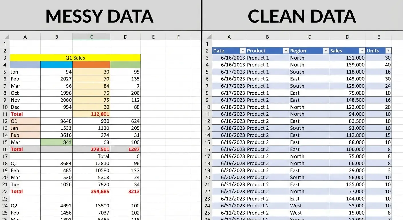
The Flat Table Rule
Pivot tables in Excel need flat, tabular data. Every row should represent one observation or transaction. Every column should represent one variable. No exceptions.
If your data has subtotals, remove them. If you have category headers inserted as rows within your data, convert them to a proper column. If you’re using blank rows for visual spacing, delete them. Yes, this makes your source data less pleasant to look at. That’s the tradeoff.
According to Excel data structure best practices, the first row must contain a clear header describing the data in the columns, each column should only contain data of a single type, and each row should only contain data from a single time point. These structural requirements aren’t suggestions. They’re prerequisites for functional Excel PivotTable creation.
Here’s what flat data looks like in practice:
-
Each row is one complete record (one sale, one expense, one customer interaction)
-
Column headers are in exactly one row
-
No blank columns or rows within your data range
-
No merged cells anywhere
-
Consistent data types within each column (all dates are dates, all numbers are numbers)
The Consistency Problem That Ruins Everything
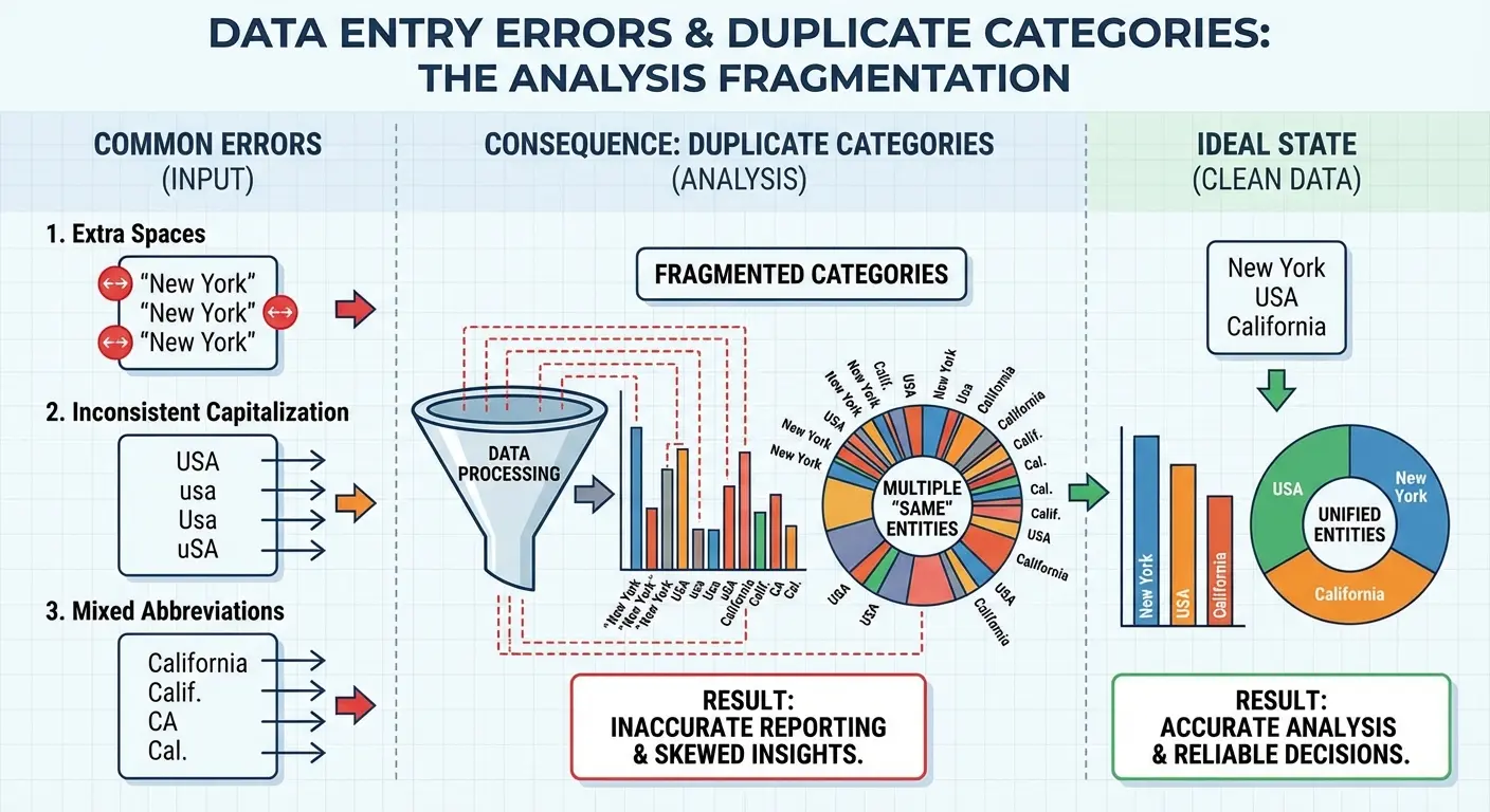
Inconsistent data entry is where pivot tables expose every shortcut anyone ever took. If your team sometimes enters “New York,” sometimes “NY,” and sometimes “new york” (with a lowercase n), your pivot table will treat those as three separate categories.
Clean this before building your pivot table, not after. Find and replace is your friend here, but you also need to think systematically about why the inconsistencies exist. Is it a training issue? A lack of data validation in your source system? A dropdown list that’s missing common options?
|
Data Consistency Issue |
How It Breaks Pivot Tables |
Prevention Strategy |
|---|---|---|
|
Inconsistent capitalization (“New York” vs “new york”) |
Creates duplicate categories in row labels |
Use data validation lists or UPPER/LOWER functions |
|
Extra spaces (” Boston” vs “Boston”) |
Treats identical values as separate entries |
Use TRIM function to remove leading/trailing spaces |
|
Multiple date formats (1/15/2024 vs Jan 15, 2024) |
Prevents proper date grouping and timeline features |
Format entire column as Date type before building |
|
Abbreviations mixed with full names (“NY” vs “New York”) |
Splits single category across multiple rows |
Standardize using Find & Replace before analysis |
|
Misspellings (“Reveune” vs “Revenue”) |
Creates incorrect category counts |
Implement spell-check or dropdown validation in source |
|
Null values vs zeros vs blanks |
Distorts COUNT and SUM calculations |
Decide on standard (usually blank for missing data) |
The same principle applies to dates, product names, categories, and any other field you might want to group or filter by. One typo creates a separate category. One extra space at the end of a text entry creates a separate category. Pivot tables are completely literal about this stuff.
The Column Structure That Enables Analysis
Think ahead about how you’ll want to slice your data. If you have a date column, you might want to analyze by month, quarter, or year. Some pivot table features can extract those automatically, but you’ll have more control if you create those columns explicitly in your source data.
The same goes for any calculated categories. If you want to analyze products by price tier (budget, mid-range, premium), create that column in your source data rather than trying to build it inside the pivot table. It’s possible to do it in the pivot table using grouped fields, but it’s fragile and breaks easily when data updates.
Add columns that represent the dimensions you’ll analyze by, even if they feel redundant. If you have a full date but you know you’ll primarily analyze by month, add a month column. If you have detailed product SKUs but you’ll analyze by product category, add the category column.
Building Your First Pivot Table (With Intent, Not Muscle Memory)
Now we build the thing. Select your data range (including headers), go to Insert, then PivotTable. Excel will ask where you want to place it. New worksheet is the right answer unless you have a specific reason to embed it in an existing sheet.
You’re now staring at a blank pivot table with a field list on the right side. This is where most tutorials tell you to start dragging fields into boxes. Stop and look at your written question from earlier.
For teams struggling with advanced analytics for strategic growth, understanding how to create a pivot table in Excel becomes even more critical when scaling data operations. Learning what is a pivot table and its core functionality transforms how teams approach data analysis.
The Four Quadrants and What Goes Where
Pivot tables in Excel have four areas: Filters, Columns, Rows, and Values. Understanding what each one does changes how you think about building your table.
Rows create your vertical categories. These should be the primary dimension you’re analyzing by (customers, products, time periods, regions). You can have multiple fields in Rows, which creates a hierarchy, but each additional level makes your table harder to scan.
Columns create your horizontal categories. Use these sparingly. A pivot table with multiple column fields becomes unwieldy fast. Most of the time, you want one column field at most (often none).
Values are your metrics (sum of sales, count of transactions, average of scores). This is what you’re measuring. You can have multiple value fields, but again, restraint makes your table more readable.
Filters sit above your table and narrow the entire dataset. These are useful for high-level filtering (show me everything from Q3, or everything from the Northeast region) but they’re not great for interactive exploration.
|
Pivot Table Area |
Best Used For |
Typical Fields |
When to Use Multiple |
Common Mistakes |
|---|---|---|---|---|
|
Rows |
Primary grouping dimension |
Products, Customers, Regions, Time Periods |
2 levels max for hierarchy |
Adding 3+ levels creates cognitive overload |
|
Columns |
Secondary comparison dimension |
Time periods, Categories, Yes/No fields |
Rarely. Usually 0 or 1 field |
Multiple column fields create unwieldy width |
|
Values |
Metrics being measured |
Revenue, Units, Averages, Counts |
2-4 related metrics |
Mixing unrelated metrics (revenue + customer count) |
|
Filters |
High-level data narrowing |
Date ranges, Departments, Status flags |
When entire table needs same filter |
Using filters when slicers would be clearer |
The First Field You Place Matters More Than You Think
Start with your primary dimension in Rows. If you’re analyzing sales by product, products go in Rows. If you’re analyzing website traffic by source, sources go in Rows.
Then add your metric to Values. Excel will default to Sum for numbers and Count for text fields. That default is right maybe 60% of the time, so check it. Right-click the field in the Values area and choose “Value Field Settings” to change it to Average, Count, Min, Max, or whatever makes sense for your question.
An operations manager at a logistics company was analyzing delivery performance. She dragged “Carrier Name” into Rows and “Delivery Days” into Values. Excel defaulted to “Sum of Delivery Days,” which gave her a meaningless total of 47,392 days. After changing the Value Field Setting to “Average,” she immediately saw that Carrier A averaged 2.3 days while Carrier B averaged 4.7 days. The correct aggregation function transformed useless numbers into actionable insight.
Only add additional fields if they directly serve your specific question. The temptation is to add everything that might be interesting. Resist this. Every field you add is another decision point for whoever reads your table, and decision fatigue is real.
The Hierarchy You can drag multiple fields into Rows to create a hierarchical view (Region > State > City). This creates those expandable/collapsible sections with plus and minus signs. It looks sophisticated. It’s a mistake most of the time. Hierarchies make sense when your question specifically requires drilling down through levels. But you’re better off with a flat list and using filters or slicers to narrow down what’s visible. Hierarchies hide information by default, which means people have to expand sections to see the full picture. If you do use hierarchies, keep them to two levels maximum. Three levels is almost always too complex for quick comprehension. Four or more levels means you should probably be building separate pivot tables for different questions.
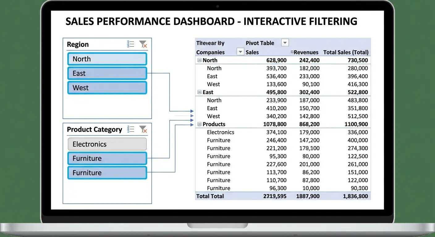
Filters vs. Slicers: They’re Not the Same Thing
Filters, slicers, and timelines all narrow down what’s visible in your pivot table. They’re not interchangeable, and choosing the wrong one creates confusion or limits functionality.
Regular Filters vs. Slicers
Regular filters (the ones you add to the Filters area of your pivot in Excel) work fine when you’re the only person using the file. They’re compact and they don’t take up space on your worksheet. But they have a major drawback: you can’t tell at a glance what’s currently filtered.
Someone opens your file and sees your pivot table showing $500K in sales. Are those total sales, or sales filtered to one region? You have to click into the filter dropdown to check. This creates ambiguity and increases the chance of someone making a decision based on incomplete data.
Slicers solve this problem. They’re visual filter buttons that sit on your worksheet and clearly show what’s selected. If your slicer shows “Northeast” highlighted, everyone knows immediately that the table is filtered to Northeast data.
Downside? They take up real estate. If you’re trying to fit everything on one screen, slicers might not be worth it. But usually they are. Clarity beats compactness.
According to a recent guide on Excel PivotCharts (Resourceful Finance Pro), slicers have become essential for building user-friendly dashboards, with the ability to link multiple PivotTables and PivotCharts simultaneously. This cross-table filtering capability transforms slicers from simple filters into dashboard control centers.
To add a slicer, click anywhere in your pivot table, then look for the PivotTable Analyze tab (might just say Analyze, depending on your Excel version. Microsoft can’t make up their mind). Click Insert Slicer, pick your fields, done.
Timeline Filters for Date Fields
If you’re working with dates, timelines are the right tool. They’re specialized slicers designed specifically for date fields, and they let you filter by day, month, quarter, or year with a visual slider interface.
Timelines make it obvious what date range is currently displayed, which matters for time-based analysis. They also make it easy to shift the date range (slide it forward or backward) without having to manually select new dates.
Add a timeline the same way you add a slicer: PivotTable Analyze tab, then Insert Timeline. You’ll only see this option if your pivot table includes at least one date field.
The Multi-Select Problem
Both filters and slicers allow you to select multiple items (showing data for three regions instead of one). This is powerful but dangerous. When multiple items are selected, your pivot table shows combined data, which might obscure important differences between those items.
If you’re selecting multiple items to compare them, you usually want them as separate rows or columns in your table, not combined. If you’re selecting multiple items to exclude a few outliers or irrelevant categories, that’s a valid use case.
Multi-select should serve your specific question, not just happen because you clicked a few checkboxes.
Calculated Fields: Where Pivot Tables Go From Useful to Indispensable
Calculated fields create new metrics inside your pivot table using formulas. This is where pivot tables become genuinely powerful for analysis instead of just summarization.
You access calculated fields through PivotTable Analyze > Fields, Items & Sets > Calculated Field. You’ll get a dialog box where you name your field and write a formula.
When building complex reporting systems, understanding marketing ROI calculations within pivot tables can streamline performance tracking significantly.
How Calculated Fields Work Differently
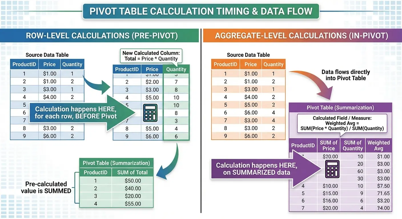
Most people miss this: calculated field formulas work on the aggregated data, not on individual rows. If you create a calculated field that divides Revenue by Units, it calculates (Sum of Revenue) / (Sum of Units), not the average of (Revenue/Units) for each row.
This matters. Those two calculations give different results when your data has varying values. You need to think through whether you want the calculation to happen before or after aggregation.
A retail analyst needed to calculate average transaction value across 15 stores. Her dataset had 50,000 individual transactions. She created a calculated field dividing Total Revenue by Transaction Count, which gave her the correct overall average of $47.32. When she tried calculating average transaction value in the source data first, then averaging those averages in the pivot table, she got $52.18. Wrong because it weighted small stores equally with large stores. Understanding aggregation order prevented a significant analytical error.
If you need row-level calculations, do them in your source data before creating the pivot table. If you need calculations on the aggregated results, use calculated fields.
Common Calculated Fields That Add Value
Profit margin: (Revenue minus Cost) divided by Revenue. This only makes sense as a calculated field if you want the overall margin across all selected data, not the average of individual margins.
Percentage change: (Current Period minus Previous Period) divided by Previous Period. You’ll need your time periods as columns for this to work cleanly.
Variance to target: Actual minus Target. Simple, but useful for performance reporting.
The formula syntax in calculated fields is straightforward. You reference other fields by name (Excel will show you a list), and you can use standard operators (+, -, *, /) and functions (though the function library is limited compared to regular Excel formulas).
When you’re building calculated fields, ask yourself:
-
Does this calculation need to happen on individual rows or aggregated totals?
-
If row-level: add the calculation as a new column in source data
-
If aggregate-level: use a calculated field in the pivot table
-
Have I verified the formula works correctly with my aggregation type (Sum, Average, Count)?
-
Does my field name clearly indicate it’s calculated?
-
Will this calculation still make sense if someone filters the pivot table?
The Naming Convention That Saves Confusion
Name your calculated fields clearly and distinctively from your source data fields. If you have a source field called “Revenue” and you create a calculated field for profit margin, don’t call it “Margin” or “Profit.” Call it something like “Calculated Profit Margin” or “Margin %.”
This makes it obvious which fields are calculated and which came from your source data. It also prevents naming conflicts, which can cause errors in your formulas.
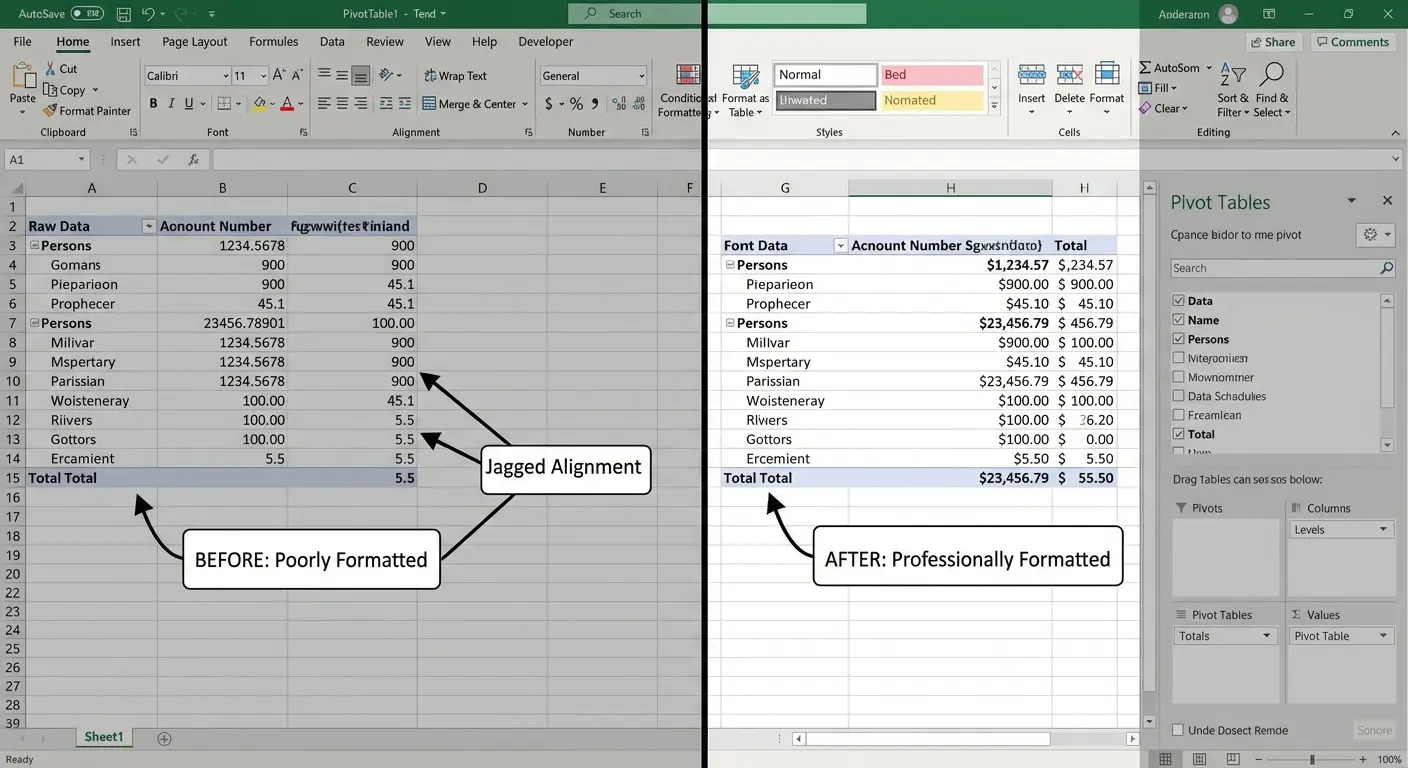
Formatting That Actually Communicates (Not Just Decorates)
Formatting in pivot tables serves one purpose: making your data easier to interpret correctly. Every formatting choice should reduce cognitive load or highlight something important.
Number Formats That Match Your Data Type
Currency should look like currency ($1,234.56). Percentages should look like percentages (12.3%). Dates should look like dates (Jan-2024 or 1/15/2024, depending on your context).
Excel doesn’t always apply the right format automatically. Right-click any value in your Excel pivot table, choose Value Field Settings, then click Number Format to set it explicitly.
Decimal places matter. If you’re showing millions of dollars, two decimal places creates false precision ($1,234,567.89 implies accuracy to the penny when you’re probably estimating). Round to thousands or show whole numbers.
Conditional Formatting for Pattern Recognition
Conditional formatting in pivot tables helps readers spot patterns quickly. Data bars show relative magnitude at a glance. Color scales highlight high and low values. Icon sets can show positive/negative trends or performance tiers.
Use these sparingly. A pivot table with three different conditional formatting rules applied becomes visual noise. Pick the one formatting approach that most directly serves your analytical question.
To apply conditional formatting, select the values you want to format, then go to Home > Conditional Formatting. Choose your rule type. Be aware that when your pivot table updates with new data, you might need to reapply or adjust your formatting rules.
The Subtotal Decisions That Change Readability
By default, pivot tables show subtotals for every group when you have multiple row fields. This is often helpful, but sometimes it clutters your table with numbers you don’t need.
You can turn subtotals off for specific fields. Right-click the field name in your pivot table, choose Field Settings, then select “None” under Subtotals. You can also change whether subtotals appear at the top or bottom of each group.
Grand totals (the overall total row at the bottom and total column on the right) can be turned off through PivotTable Design > Layout > Grand Totals. Turn them off if your question is about relative proportions or comparisons rather than absolute totals.
The Refresh Problem Everyone Ignores Until It’s Too Late
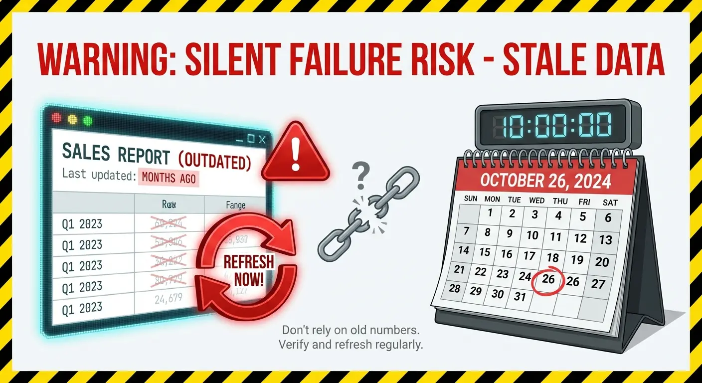
Nobody tells you this until it’s too late: Excel pivot tables don’t automatically update when your source data changes. You have to manually refresh them.
This creates a silent failure mode. Your source data gets updated with new transactions, but your pivot table still shows last week’s numbers. Nothing looks broken. The table displays without errors. But your analysis is wrong.
I’ve seen this kill entire reporting processes. Finance team sends monthly numbers to the board. Board makes decisions. Three months later someone realizes the pivot table hadn’t been refreshed since January. Every decision was based on stale data. Nobody caught it because nothing looked wrong.
Manual Refresh and Why It’s Not Enough
Right-click anywhere in your pivot table and choose Refresh. Or click the Refresh button in the PivotTable Analyze tab. This updates your table with current data from the source range.
The problem is that manual refresh requires someone to remember to do it. If you send your pivot table file to a colleague, will they know to refresh before reading it? If you open last month’s report file to check a historical number, will you remember that the pivot table might be stale?
You can set pivot tables to refresh automatically when the file opens. Go to PivotTable Analyze > Options > Data tab, then check “Refresh data when opening the file.” This helps, but it’s not foolproof. What if someone has the file open when new data arrives?
The Source Range Problem
If your source data grows (new rows get added), your pivot table won’t automatically include them unless you defined your source range as a dynamic range or Excel Table.
According to Excel Table best practices, converting your source data to an Excel Table before creating your pivot table ensures that Tables automatically expand when you add new rows, and pivot tables built from Tables automatically pick up those new rows when you refresh. This structural decision eliminates one of the most common pivot table failure modes.
The best practice is to convert your source data to an Excel Table before creating your pivot table. Select your data, press Ctrl+T (or go to Insert > Table), and confirm the range. Tables automatically expand when you add new rows, and pivot tables built from Tables automatically pick up those new rows when you refresh.
If you didn’t start with a Table, you can change your pivot table’s source range. Go to PivotTable Analyze > Change Data Source, then select the new range (or convert to a Table first, then point to the Table name).
The Version Control Nightmare
Multiple people working with the same pivot table in different file versions creates chaos. Person A refreshes their copy with Monday’s data. Person B has Friday’s data. Both send reports to the executive team. The numbers don’t match. Nobody knows which version is correct.
This is where you need to think about workflow, not just Excel mechanics. Should this pivot table live in a shared location where everyone accesses the same file? Should it be rebuilt fresh from a central data source for each reporting period? Should you be using Power BI or another tool instead of Excel?
These aren’t Excel questions, they’re process questions. But they determine whether your pivot table becomes a trusted reporting tool or a source of confusion and conflicting numbers.
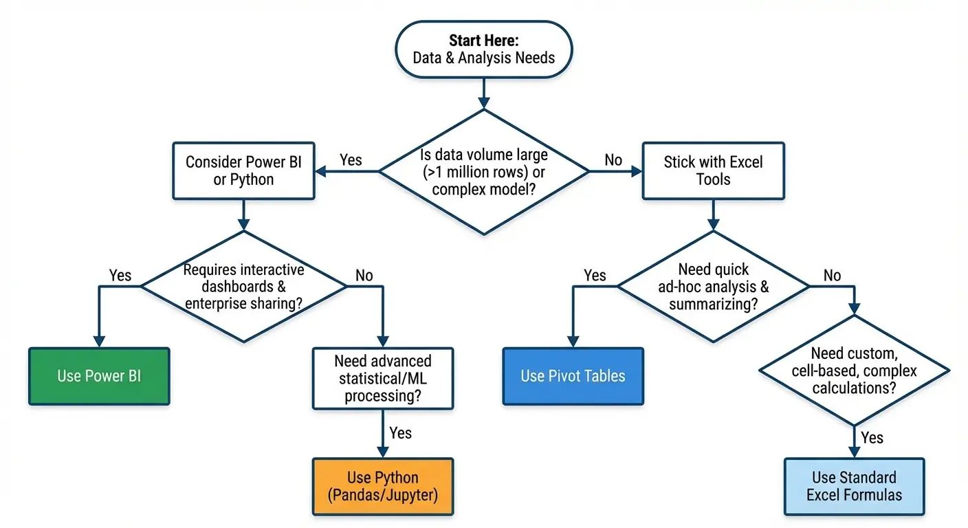
Sometimes Pivot Tables Are the Wrong Tool
Pivot tables are powerful, but they’re not the right tool for every analytical question. Knowing when to use something else is just as important as knowing how to use Excel pivot table features effectively.
Complex Calculations That Fight Against Pivot Table Logic
If your analysis requires row-by-row calculations that then get aggregated in non-standard ways, you’re fighting against how pivot tables work. You’ll spend hours trying to force calculated fields to do something they’re not designed for.
The landscape of Excel data analysis is evolving rapidly. According to the Journal of Accountancy, Microsoft recently introduced the PIVOTBY function in Excel 365 and Excel 2021, which allows users to create comprehensive data summaries using formulas rather than traditional PivotTables. This function offers an alternative when you need more control over calculation logic or when traditional pivot table limitations become constraints.
Build your calculations in your source data instead. Use regular Excel formulas on your flat data table, then create a pivot table from the results. Trust me, I’ve wasted entire afternoons trying to force calculated fields to do things they’re not designed for. Just build it in your source data and save yourself the headache.
When Your Audience Needs the Raw Detail
Pivot tables summarize. That’s their purpose. If your stakeholders need to see individual transactions or drill down to specific records, a pivot table might not be the right deliverable.
You can show detail from a pivot table by double-clicking any value (Excel creates a new sheet with the underlying records), but this is clunky for regular use. If detail access is a core requirement, consider building a filterable table instead of a pivot table.
The Data Volume Threshold
Pivot tables start to slow down with very large datasets (hundreds of thousands of rows, multiple complex calculated fields, lots of unique values in your dimension fields). You’ll notice lag when refreshing, filtering, or modifying the table structure.
If you’re regularly working with data at this scale, you’ve outgrown Excel pivot tables. Power Pivot (an Excel add-in) handles larger datasets more efficiently. Power BI is designed for this scale. Even a database with SQL queries might be more appropriate than forcing Excel to handle data it wasn’t designed for.
When Automation Matters More Than Flexibility
Pivot tables require manual interaction (refreshing, filtering, adjusting). If you need fully automated reporting that runs on a schedule and emails results without human intervention, pivot tables aren’t the answer.
You need either Excel macros (VBA) that manipulate pivot tables programmatically, or you need to move to a different tool entirely. Python scripts, R, Power BI scheduled refreshes, or business intelligence platforms all handle automated reporting better than manually-refreshed Excel pivot tables.
If you’re finding that your pivot tables keep breaking, require constant maintenance, or create more questions than they answer, that’s a signal. The tool might not be the problem. The underlying data architecture, the reporting requirements, or the workflow might need redesigning.
We work with teams who’ve hit this exact wall. Pivot tables that worked fine for six months suddenly can’t keep up with the data volume, or the reporting requirements have gotten complicated enough that Excel’s just not cutting it anymore. Sometimes the fix is better pivot table architecture. Sometimes it’s admitting you need Power BI or a proper data warehouse. If you’re not sure which, we can help figure it out.
Final Thoughts
Understanding what is pivot table functionality becomes genuinely useful when you build them with intent rather than habit. The mechanics aren’t complicated (drag fields, choose aggregation type, format the results). What’s hard is the thinking that happens before you touch Excel: defining the question, structuring your data properly, choosing the right level of detail for your audience.
Most pivot table problems aren’t technical problems. They’re clarity problems. Unclear questions produce unclear tables. Messy source data produces unreliable analysis. Skipping the refresh step produces wrong numbers that look right.
You now know how to use Excel pivot table features to avoid those traps. You understand that data structure determines 80% of your success. You know that calculated fields work on aggregated data, not individual rows. You know that filters and slicers aren’t interchangeable. You know that Excel pivot tables fail silently when source data changes.
Next time you need to build a pivot table, slow down. Spend three minutes writing down your actual question before you click Insert. Check if your data’s clean enough to work with. Think about who’s reading this and what they need to do with it.
Most of my pivot tables still aren’t perfect. But they get used now instead of downloaded once and forgotten. That’s the bar.