
Table of Contents
-
Why Most Wedding Website Galleries Miss the Point
-
Websites Built for Guests Who Don’t Read Instructions
-
Websites That Handle Complex Family Situations
-
Websites Designed for Multi-Day or Destination Events
-
Websites That Prioritize Accessibility and Inclusion
-
How The Marketing Agency Approaches User-Focused Design
-
What Actually Matters
Look, I’ve wasted hours scrolling through wedding website galleries. They’re gorgeous. They’re useless.
Every gallery shows you seventeen shades of dusty rose and zero solutions for “my parents are divorced and this is awkward” or “half my guests speak Spanish.” Your aunt doesn’t care about your color palette. She needs to know where to park.
Wedding websites have become essential planning tools, with couples recognizing that so many components leading up to, and sometimes after, your wedding day means there’s a lot your guests need to know, which is why wedding websites have become an essential online hub that helps couples and their guests stay organized and informed of all the details about your big day.
Think about how your guests actually use your website. They’re checking it on their phone while sitting in traffic, trying to remember if the ceremony starts at 4:00 or 4:30. They’re your grandmother squinting at her iPad, wondering why nothing’s clickable. They’re your college friends who lost the invitation but need the venue address right now.
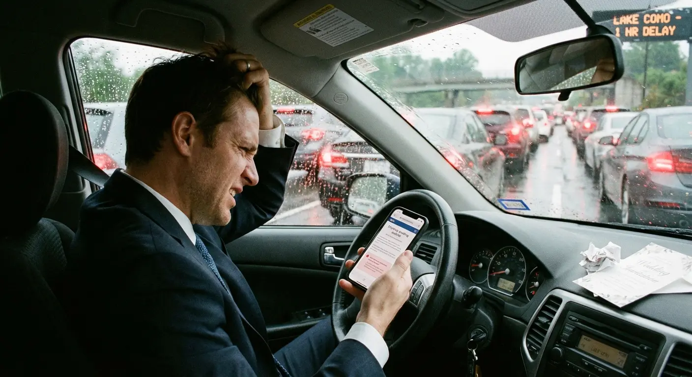
Wedding websites fail when couples care more about their aesthetic than whether Grandma can find the damn address. They succeed when guests can find what they need in under 30 seconds, regardless of when they’re looking or what device they’re using.
The typical inspiration gallery approach completely misses this point. You end up overwhelmed by pretty templates that don’t address your specific logistical challenges. You need a website that works under real-world conditions, not one that photographs well for Pinterest.
Why Most Wedding Website Galleries Miss the Point
Here’s what those galleries won’t tell you: function matters more than beauty when your guests are panicking in a parking lot.
I’ve seen couples stress for weeks over font pairings while burying their venue address in paragraph four of their love story. Guess how many people called them for directions? Too many.
The websites ahead aren’t here because they’re pretty (though some are). They’re here because they solve specific, real problems. Complex family dynamics. Multi-day events where guests need to figure out which parts are optional. Accessibility needs that span three generations and varying tech literacy.
Your guests are busy, distracted, or simply assume they know what they need to know. Most of them skim. Actually, let me be more direct: your guests won’t read anything. They’ll scan, squint, give up, and text you.
The best sites anticipate this and design around it.
Websites Built for Guests Who Don’t Read Instructions
These sites use visual hierarchy and smart content placement to make sure critical information gets seen even by guests who won’t read past the homepage.
The common thread? Making important stuff impossible to miss.
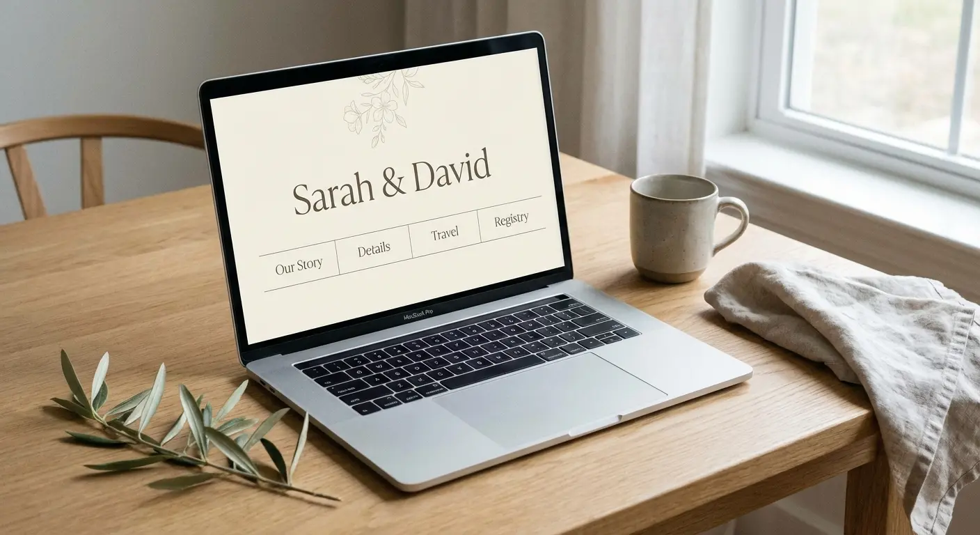
1. Just Make It One Page, Seriously
Sarah and Mike’s wedding website fits everything on one continuous page. Date and venue appear immediately, followed by timeline, travel info, registry, and RSVP in that order.
There’s no navigation menu because there’s nowhere to navigate.
Guests simply scroll. That’s it. Visual breaks between sections prevent the page from feeling overwhelming despite its length. Subtle background color changes, whitespace, small decorative elements. This structure works because it matches how people naturally process event information: when, where, what’s happening, how do I prepare, how do I respond.
The site loads fast because there are no page transitions. Mobile users never have to tap through multiple screens to find basic details. Everything flows in one logical path from top to bottom. Guests can’t get lost.
2. Four Buttons. That’s All You Need.
The Knot template used by Jessica and Tom keeps four buttons visible at all times: When & Where, Hotels, Registry, RSVP.
Everything else lives on the page but doesn’t compete for navigation real estate.
The brilliance is in what got cut. No “Our Story” button. No “Travel” button (it’s combined with Hotels). No “FAQs” button cluttering the header. Those sections exist on the site, but they’re not deemed critical enough for persistent visibility.
The RSVP button changes color once a guest has submitted their response. Visual confirmation. No more “did I already do that?” confusion.
Guests aren’t scanning through eight navigation options trying to remember which one contains the information they need. The four most important things are always right there.
3. Homepage as Command Center
Zola’s dashboard approach puts every critical detail above the fold. Date, countdown timer, venue name and address (with map pin icon linking to Google Maps), and RSVP status all appear before any scrolling happens.
Below that sits a grid of six large tiles: Schedule, Travel, Things to Do, Wedding Party, Registry, Q&A. Each tile is big enough to tap easily on mobile and uses an icon plus two-word label.
The homepage never tries to tell you everything. It tells you the absolute essentials and then provides clear pathways to everything else. Guests who just need the basics get them instantly. Guests who want more context can explore without wading through content they don’t care about.
The design respects both user types.
4. Visual Timeline That Makes Sense
Amanda and Chris’s timeline uses a vertical infographic format instead of paragraph text. Icons represent each event (ceremony, cocktails, dinner, dancing) connected by a dotted line with times clearly marked.
Color coding distinguishes required events from optional ones without requiring guests to read fine print. Location changes are indicated by map pin icons with venue names.
The entire day’s flow is comprehensible in 10 seconds of scanning.
Compare this to the typical approach: a text block explaining that the ceremony begins at 4:00 PM at St. Mary’s Church followed by a cocktail hour at 5:30 PM at the reception venue, with dinner service beginning at 6:30 PM. Same information, vastly different cognitive load.
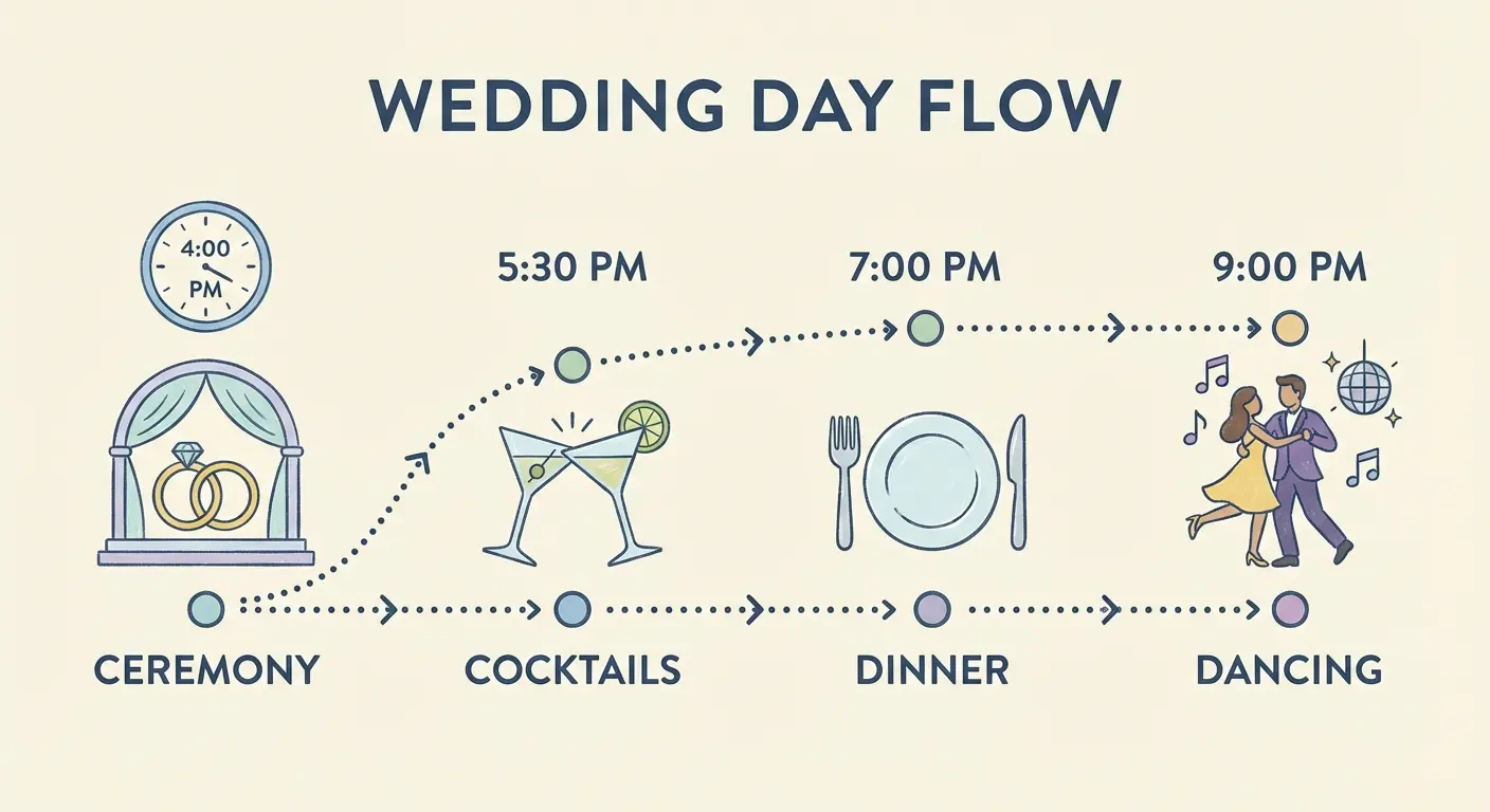
Visual timelines work because they externalize the mental model guests are already building. They can see the flow of the day without having to construct it in their heads from written descriptions.
5. Mobile-First Minimalism
Knowing that most guests would check their site while getting ready or driving to the venue, Rachel and David designed exclusively for mobile, then adapted for desktop.
Every button is thumb-sized. Every text block is three sentences maximum. The venue address includes a one-tap “Open in Maps” button rather than embedded directions that don’t work on mobile.
Photos are compressed aggressively for fast loading on cellular connections. The RSVP form uses large input fields and dropdown menus instead of radio buttons (easier to tap accurately). There’s no hamburger menu hiding navigation because everything fits on screen.
This site won’t win design awards for its desktop version, but it works flawlessly in the context where it’s used: on a phone, under time pressure, possibly with spotty reception.
Here’s what matters on mobile versus desktop:
Navigation: Single-tap buttons beat multi-level menus. Thumbs can’t hover.
Text: 2-3 sentences max instead of 3-4 paragraphs. Scrolling fatigue is real.
Images: Compressed singles instead of high-res galleries. Load speed on cellular matters more than quality.
Forms: Single column stack instead of multiple columns. Way easier to fill out on small screens.
CTAs: Thumb-sized targets instead of standard buttons. Accuracy while moving.
Websites That Handle Complex Family Situations
Blended families, divorced parents, non-traditional family structures, and multiple hosts create communication challenges that go beyond logistics.
The wording on your website can either honor everyone involved or create hurt feelings before the wedding even happens.
The goal? Clarity without awkwardness, inclusion without over-explanation.
6. The Diplomatic Host Listing
When Lauren’s parents are divorced and both remarried, and Jake’s mom is hosting solo, the traditional invitation wording doesn’t work. Their website opens with “Together with their families, Lauren Chen and Jake Morrison invite you to celebrate their wedding.”
No names. No hierarchy. No accidentally leaving someone out or implying one family is more important.
The “Our Families” page includes photos and brief intros for both sets of Lauren’s parents and Jake’s mom, all presented with equal visual weight and affection. Nobody’s listed as “hosting” because that creates ranking.
The site acknowledges that these people are important and loved without getting into the mechanics of who’s paying for what. It shifts focus from traditional roles to actual relationships.
7. Separate Ceremony Instructions for Different Groups
David and Michael’s wedding includes a small private ceremony for immediate family at 2:00 PM, followed by a larger celebration for all guests at 4:00 PM.
Rather than explaining this complex structure on the main site (which confuses general guests and makes family feel like an afterthought), they use password-protected pages.
Family members received a separate insert with their invitation containing the password and URL for the family-specific page. That page includes the earlier timeline, special parking instructions, and details about photos before the main ceremony. The public site only mentions the 4:00 PM start time.

This prevents the “wait, am I supposed to come early?” confusion while making family feel genuinely included rather than just mentioned in an FAQ.
8. The “Our People” Approach to Wedding Parties
Emma and Sophie’s wedding party includes Emma’s brother as her “best man,” Sophie’s male best friend as her “man of honor,” and several attendants who don’t identify with gendered labels.
Instead of “Bridesmaids and Groomsmen,” their site says “Our People” with individual bios that never mention which side they’re on or what their role is called.
Each person gets a photo, name, and two-sentence description of their relationship to the couple. “Sophie’s college roommate and the person who introduced us” or “Emma’s brother and our go-to adventure buddy.”
This framing makes the wedding party feel like a collection of beloved humans rather than a gendered lineup. It also eliminates the need to explain why the sides are uneven or why someone’s standing on the “wrong” side.
9. Addressing the Plus-One Ambiguity
Nothing causes more confusion and frustration than unclear plus-one policies.
Megan and Ryan’s FAQ section includes this exact wording: “We’ve indicated on your invitation whether you have a plus-one. If your invitation is addressed to you ‘and guest,’ please include their name when you RSVP. If your invitation is addressed only to you, we’re keeping the celebration intimate and aren’t able to accommodate additional guests. We know this can be disappointing, and we appreciate your understanding.”
Direct. Clear. Apologetic without being defensive.
The RSVP form reinforces this by only allowing guests to add names if their invitation included a plus-one (the system knows based on how invitations were logged). Nobody RSVPs for a plus-one they don’t have because the form won’t let them. This prevents the awkward situation where you have to have an uncomfortable conversation later.
Being upfront about your plus-one policy saves everyone from awkwardness down the line.
Websites Designed for Multi-Day or Destination Events
Destination weddings and multi-day celebrations require fundamentally different information architecture. Guests need to make travel decisions, understand which events are optional, coordinate logistics across multiple locations, and plan their time.
When planning destination celebrations, it’s important to remember that guests spend about $1,000 on average per wedding they attend, making it essential to provide them with all relevant information about your wedding reception, ceremony, and other events through your website so they can plan ahead and budget appropriately.
These sites show how to organize complex information without overwhelming people or making them feel like they need a project manager to attend your wedding.
10. The Itinerary Builder
For their three-day Napa wedding, Olivia and James created an interactive schedule that lets guests filter by what applies to them.
The full itinerary shows 12 different events: welcome drinks, vineyard tour, ceremony, cocktail hour, dinner, after-party, next-day brunch, and more. But guests can toggle filters: “Required Events,” “Family Only,” “All Guests Welcome,” “Kids Invited.”
When someone selects “Required Events,” they see only ceremony and dinner. When they select “All Guests Welcome,” they see everything except the family-only rehearsal.
Nobody has to play detective to figure out if they’re actually invited. Each event card shows time, location, dress code, and a one-sentence description. Guests can add individual events to their phone calendar with one tap.
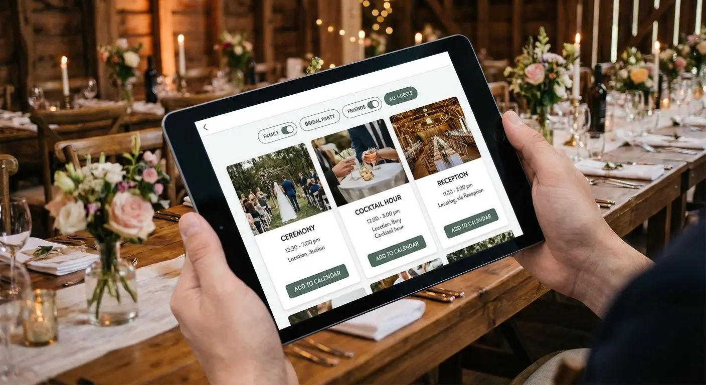
The system respects that not everyone wants to attend everything while making those who do want full participation feel welcomed.
11. Destination Hub with Embedded Maps
Destination weddings in unfamiliar locations create anxiety. Where should I stay? How far is the venue from the airport? What’s nearby?
Nicole and Mark’s Cabo wedding site includes a custom Google Map with pins for the resort, airport, recommended restaurants, activities, and a pharmacy. Clicking any pin shows distance from the resort and brief notes: “15-minute drive, great for sunset dinner” or “Walking distance, best fish tacos.”
The hotel block information sits directly above the map so guests can see spatial relationships before booking. There’s also a “Getting Around” section explaining that the resort offers shuttles, Uber works reliably, and rental cars aren’t necessary but available.
This embedded approach means guests don’t have to open separate apps or do their own research. Everything they need to make informed decisions lives in one place.
12. The Travel Logistics Page That Thinks of Everything
International destination weddings require even more hand-holding. For their Italy wedding, Grace and Antonio created a “Travel” page organized by decision point rather than topic.
Section one: “Before You Book” (passport requirements, best flight routes, when to book for good prices).
Section two: “Planning Your Trip” (weather in May, what to pack, voltage adapters, basic Italian phrases).
Section three: “When You Arrive” (airport transportation, local SIM cards, tipping customs).
Section four: “Wedding Day” (shuttle schedule, backup transportation, what time to be ready).
This structure matches how guests plan, moving chronologically through their decision-making process.
Turns out people can handle a lot of information if you don’t throw it at them all at once. Here’s what guests need at each stage:
Before Booking: Flight routes, passport requirements, best booking windows. Timeline with price guidance answers “When should I buy tickets?”
Pre-Departure: Packing lists, weather, local customs. Checklist format by category answers “What should I bring?”
Upon Arrival: Transportation, currency, SIM cards. Step-by-step with costs answers “How do I get from airport to hotel?”
Wedding Day: Shuttle times, backup plans, timing. Hour-by-hour timeline answers “When do I need to be ready?”
Post-Wedding: Checkout times, departure logistics. Recommended departure windows answer “What time should I leave for airport?”
13. Hotel Block Status Tracker
When you’ve reserved blocks at three different hotels with varying price points, guests need transparency.
Kevin and Lisa’s site shows all three options with current availability updated weekly. “Beachfront Resort: 12 rooms remaining in our block” vs. “Budget Hotel: Block is full, but rooms still available at standard rates.”
This creates gentle urgency without panic and helps guests make informed decisions based on their budget and preferences. Each hotel listing includes price per night, distance from venue, what’s included (breakfast, parking), and a “Book Now” link that goes directly to the group rate page.
Guests aren’t hunting for group codes or calling hotels to check availability. The information is current, clear, and actionable.
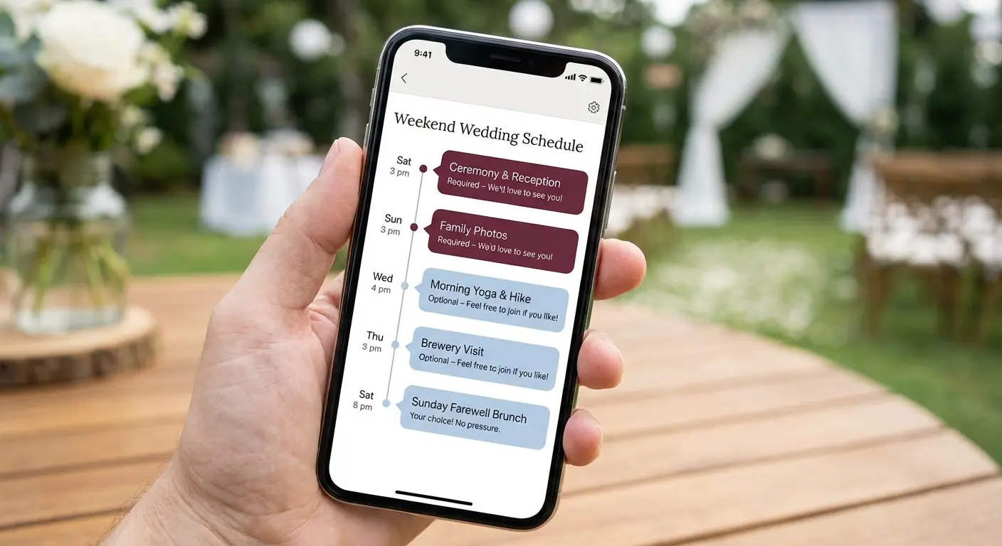
14. Weekend Schedule with Built-in Flexibility
Multi-day events often include downtime that couples feel obligated to fill. Rebecca and Chris’s mountain weekend wedding embraced flexibility instead.
Their schedule shows required events (rehearsal dinner for wedding party, ceremony, reception) and optional activities (group hike, pool time, farewell breakfast) with explicit permission to skip things. The description for the Saturday morning hike says “We’re doing this hike at 9 AM if you want to join. If you’d rather sleep in or explore town, that’s great too.”
This language eliminates guilt and increases participation because guests don’t feel obligated.
People show up to things they genuinely want to do rather than things they feel they should do. The schedule also includes several “free time” blocks, acknowledging that guests might want to explore on their own or just rest.
Giving guests permission to opt out actually improves the overall experience.
Websites That Prioritize Accessibility and Inclusion
Accessible design isn’t just ethical, it’s practical. When your guest list includes elderly relatives, people with disabilities, non-English speakers, and varying tech literacy levels, your website needs to work for all of them.
According to Brides, more couples in 2025 are incorporating bilingual wedding websites to honor the people in their lives, with sites offering information in both English and Spanish or other languages becoming a thoughtful and inclusive standard practice for diverse guest lists.
Inclusive design principles create better experiences for everyone, not just people with specific needs. Accessibility features often improve usability across the board.
15. High-Contrast, Screen-Reader-Friendly Design
Accessibility doesn’t mean ugly.
Taylor and Jordan’s website uses a clean navy and white color scheme that exceeds WCAG contrast requirements while looking elegant. Every image includes alt text describing what’s shown (“Taylor and Jordan laughing on a beach at sunset” not just “engagement photo”). Headings use proper HTML hierarchy so screen readers can navigate by section.
Links are descriptive (“View ceremony location on Google Maps”) rather than generic (“click here”). The font size is 16px minimum, large enough to read without zooming but not cartoonishly big.
These choices make the site usable for visually impaired guests while creating a cleaner, more scannable experience for everyone. Good accessibility is good design.
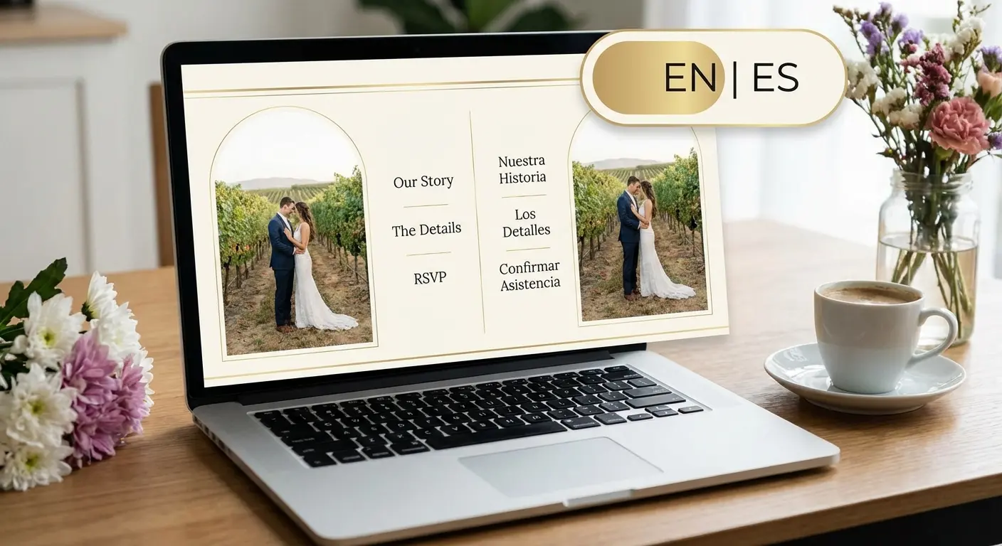
16. Multilingual Content Options
When half your guest list speaks Spanish and half speaks English, you need both.
Maria and Tom’s bilingual website includes a language toggle at the top that switches all content between English and Spanish. Critical information (date, time, venue address, RSVP) is fully translated. Less critical content (their love story, detailed FAQs) exists in English with a Spanish summary.
This pragmatic approach acknowledges that full translation is time-consuming while ensuring nobody misses essential details because of language barriers.
The RSVP form is fully bilingual, and confirmation emails are sent in the language the guest selected. This isn’t just considerate, it’s necessary for ensuring Spanish-speaking relatives know when and where to show up.
17. Large-Format, Printable Information Sheets
Not everyone is comfortable relying on digital information, especially elderly guests.
Patricia and Robert’s website includes a “Print Details” button that generates a clean, printer-friendly PDF with all essential information in 14pt font. Date, time, venue address with simple directions, timeline, hotel recommendations, and their phone numbers for questions. No photos, no decorative elements, just information formatted for easy reading and reference.
Patricia’s grandmother printed it and kept it on her fridge for three months before the wedding.
This accommodation reduces anxiety for guests who don’t trust their phones or worry about losing digital information. It takes 20 minutes to create and solves a real problem for a meaningful percentage of your guest list. Analog options complement digital experiences and make information accessible across generational divides.
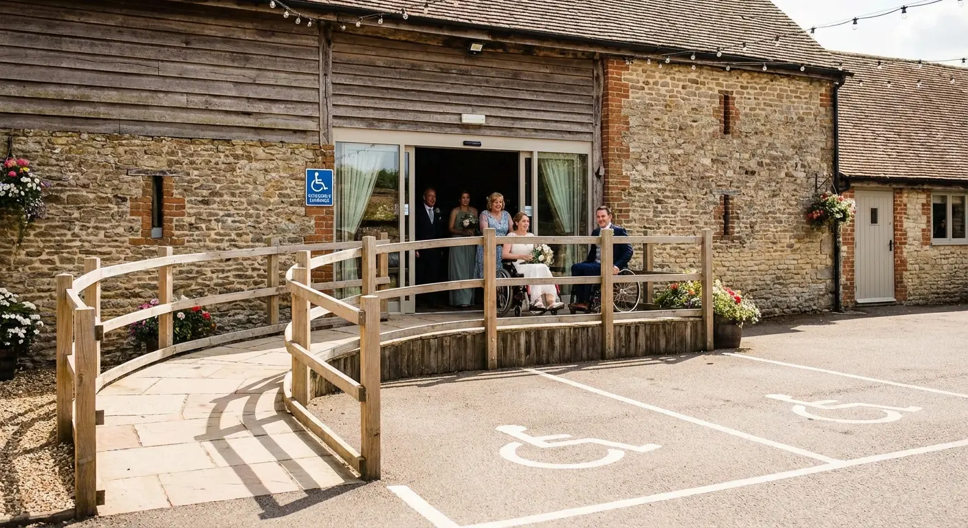
18. Venue Accessibility Details Up Front
Generic “wheelchair accessible” labels don’t tell guests what they need to know.
Hannah and Mike’s website includes specific details: “The venue has accessible parking 50 feet from the entrance with a paved, level path. The ceremony and reception are on the same floor with no stairs. Accessible restrooms are located near the bar. Seating can be arranged to accommodate wheelchairs or walkers, please let us know in your RSVP if you need specific accommodations.”
This level of detail helps guests with mobility issues, elderly relatives, and parents with strollers plan appropriately. It also signals that you’ve thought about their needs, which matters.
The information benefits more people than you think. Guests who are temporarily injured, recovering from surgery, or simply tired from travel all benefit from knowing the physical layout in advance.
How The Marketing Agency Approaches User-Focused Design
You’ve just seen 18 sites that solve problems instead of just looking pretty. That same principle applies whether you’re planning a wedding or running a business.
Full disclosure: this is what we do for clients. Not wedding websites specifically, but the same principle. Design that solves problems instead of just looking expensive.
We work with clients who are tired of beautiful websites that don’t convert, elegant landing pages that don’t answer questions, and “on-brand” content that doesn’t help users accomplish their goals. The problem isn’t usually the design itself (though sometimes it is). The problem is that the design wasn’t built around how real people behave.
Our approach starts with understanding what people are actually trying to do. What questions are they asking? What friction points are preventing them from taking action? Where are they dropping off, and why?
From there, we build information architecture that anticipates confusion before it happens. We use data to identify what content needs to be above the fold, what can live deeper in the site, and what’s noise that should be cut entirely. (Yes, sometimes the best content strategy is deletion.)
If your website looks great but doesn’t work, let’s talk. Book a free strategy call and we’ll analyze where the disconnects are happening and how to fix them with user behavior data, not guesswork.
What Actually Matters
The websites that work aren’t the ones that get featured in design showcases. They’re the ones where guests show up on time, to the right location, without texting you for directions.
Your website doesn’t need to be groundbreaking. It needs to be functional for your specific guest list, your specific logistics, and your specific family situation.
A simple one-page site might be perfect for your 50-person backyard wedding. A complex multi-page hub might be necessary for your 200-guest destination weekend.
Evaluate your needs honestly. Who are your guests? What questions will they have? What technology are they comfortable with? What information is critical versus what’s just nice to have?
Then build (or choose a template) accordingly. The goal isn’t to impress other couples browsing inspiration galleries. The goal is to get your guests the information they need so they can show up and celebrate with you instead of stressing about logistics.
Good design solves problems so elegantly that users don’t even notice the design itself. They just notice that everything worked exactly as it should.
The sites we’ve covered here represent different approaches to the same fundamental challenge: communicating complex information to diverse audiences under real-world conditions. Some use visual hierarchy. Others use progressive disclosure or segmented content. Many combine multiple strategies.
What they share is a commitment to user needs over aesthetic trends. Function without sacrificing form. Anticipating confusion and addressing it proactively.
Your wedding website should do the same. Start with your guests’ questions, build your information architecture around their needs, and design for how they’ll use the site in context. Do that, and you’ll have a website that works, which is infinitely more valuable than one that just looks good in screenshots.
Your aunt still won’t read the FAQ. But at least she’ll find the parking info.