
What’s Inside
-
Why Most Portfolio Critiques Miss the Strategic Layer
-
Portfolios Built for Client Psychology
-
Basecamp’s Anti-Portfolio Portfolio
-
Metalab’s Project-First Navigation
-
Instrument’s Case Study Depth
-
Locomotive’s Motion as Credibility
-
Resn’s Technical Transparency
-
Fantasy’s Client Logo Restraint
-
-
Portfolios Designed for Search Intent
-
Lounge Lizard’s Service-Specific Showcases
-
Huemor’s Problem-Solution Framework
-
Clay’s Outcome-Driven Headlines
-
Pentagram’s Filterable Intelligence
-
Ramotion’s SEO-Friendly Project Titles
-
Blue Fountain Media’s Industry Segmentation
-
-
Portfolios Optimized for Decision Speed
-
Zajno’s Visual Hierarchy Mastery
-
BASIC’s Minimal Cognitive Load
-
Dogstudio’s Scroll-Based Storytelling
-
Awwwards’ Social Proof Integration
-
Hello Monday’s Interactive Previews
-
Unfold’s Mobile-First Thinking
-
-
When Your Portfolio Isn’t the Problem
-
So What Should You Actually Do?
The Stuff That Actually Matters
Look, most portfolio critiques obsess over aesthetics. Wrong focus.
The portfolios that actually convert? They understand client psychology, search behavior, and how to reduce friction. Your potential clients don’t care about your Webflow skills. They want to know if you can solve their specific problem.
According to research on portfolio website effectiveness, a digital portfolio helps highlight your best work and increase online visibility. Yet most designers struggle to translate visual appeal into actual inquiries.
After looking at hundreds of these over five years, I kept seeing the same thing. The most visually stunning portfolios often convert poorly. Some aesthetically modest ones generate consistent client inquiries.
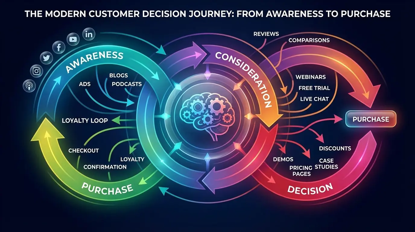
I’ve split these into three groups: psychology-focused, search-focused, and friction-reducing portfolios. Not the usual “creative agency portfolios” or “minimalist portfolios” groupings because those don’t help you understand why certain examples actually work.
Why Most Portfolio Critiques Miss the Strategic Layer
You’ve seen dozens of portfolio roundups celebrating innovative animations, bold typography, experimental layouts. They’re useful if you’re hunting for design inspiration.
But nobody talks about the boring truth.
I spent six hours last Thursday just clicking through agency portfolios. Found three that actually made me want to reach out. The rest? Beautiful. Useless.
The pattern seems to be this: portfolios that understand visitor psychology, search behavior, and decision-making friction outperform those chasing design awards. When I was building my first portfolio in 2019, I made this exact mistake. Spent three months obsessing over hover animations. Know how many clients mentioned them?
Zero.
Your prospects aren’t visiting to admire your skills (though that might impress other designers). They’re trying to answer one question: can you solve my specific problem?
This breakdown examines the psychological, technical, and structural decisions that make portfolios effective business tools. Each example reveals something specific about how conversion happens when prospects evaluate your work.
Portfolios Built for Client Psychology
Understanding how clients think matters more than any design trend. The portfolios in this section succeed because they acknowledge fundamental truths about buyer psychology.
People need social proof to feel safe. They value transparency over perfection. They respond to signals of exclusivity.
Here’s how this translates into actual portfolio decisions:
Social Proof: Display client logos and testimonials (makes people feel safe, like “Hey, IBM hired them, so…”)
Authority Building: Showcase detailed case studies with strategic thinking (demonstrates expertise beyond just making things look pretty)
Selective Exclusivity: Curate featured projects rather than showing everything (signals premium positioning, not desperation)
Transparency: Reveal process, challenges, technical details (builds trust through honesty)
Brand Alignment: Lead with work examples before company narrative (lets prospects self-qualify based on style fit)
1. Basecamp’s Anti-Portfolio Portfolio
Basecamp’s “portfolio” is basically just a wall of logos and quotes. That’s it. No case studies, no project breakdowns, nothing. Just “Hey, look who trusts us.”
And it works.
Why? Because they’re Basecamp. They’ve built enough brand equity that prospects trust them before arriving at the site. When prospects already know your reputation, they’re not evaluating your capabilities. They’re confirming that others similar to them have succeeded with your solution.
You’re not Basecamp. Don’t even think about copying this approach. Seriously, don’t.
But the principle holds: match your portfolio depth to your market recognition level. If you’re still building credibility, you need way more detail than this.
2. Metalab’s Project-First Navigation
When you land on Metalab’s site, you don’t see their manifesto or origin story. You see a grid of projects. Click one. That’s the entire strategy.
This structure works because their ideal clients (funded startups and established tech companies) want to see relevant work immediately. They’re not interested in your origin story until they’ve confirmed you’ve solved problems similar to theirs.
This approach filters visitors effectively. People who need extensive hand-holding or aren’t ready to evaluate work quality will bounce. That’s intentional.
The risk? You might lose prospects who need more context. But for portfolios targeting sophisticated buyers, leading with projects accelerates the qualification process.
I love what Metalab does here. Could it alienate some prospects? Sure. Who cares? Those aren’t their people anyway.
3. Instrument’s Case Study Depth
Instrument doesn’t just show you the finished website. Their case studies walk you through strategy, challenges encountered, why specific decisions were made. Each project page reads more like a business case than a design showcase.
Similar to what we’ve observed in our comprehensive marketing case study analysis, detailed process documentation significantly increases prospect confidence.
Why does this work? Because acknowledging project challenges and explaining how they were overcome demonstrates real problem-solving capability. Prospects can imagine working through their own complex challenges with a partner who thinks this deeply.
Most agencies hide their struggles and only show polished results. Instrument’s transparency stands out precisely because it’s rare.
This level of detail attracts high-value clients who understand that execution without strategy is just decoration.
4. Locomotive’s Motion as Credibility
When you land on Locomotive’s site, there’s this moment of “whoa” as everything smoothly animates into place. It feels expensive.
The smooth animations, scroll-triggered interactions, and performance optimization aren’t just aesthetic choices. They’re proof that the agency can execute at a high technical level. Prospects interested in cutting-edge web experiences don’t need to read about Locomotive’s capabilities because they’re experiencing them in real-time.
But here’s where it falls apart if you’re not careful: this approach only works if your execution is flawless. A buggy, slow-loading portfolio with ambitious animations damages credibility faster than a simple, fast site builds it.
(Side note: I’ve heard the Locomotive site is slow on mobile. Fair point. It works on desktop though.)
You’re essentially putting your skills on display with every interaction. One janky animation undermines the entire message. When executed properly, your portfolio becomes the most persuasive case study you have.
5. Resn’s Technical Transparency
Resn doesn’t dumb down their project descriptions. They mention specific frameworks, platforms, technical constraints openly. This attracts clients who value technical expertise as much as creative vision.

Many agencies hide technical details, assuming clients don’t care. But for digital products and complex web applications, technical capability often matters more than visual design.
What you get from this: qualification. Non-technical clients who need simple websites will look elsewhere. That’s fine. Resn is signaling clearly what type of work they excel at and who they want to work with.
Technical transparency becomes a filter that attracts the right clients while repelling poor fits.
6. Fantasy’s Client Logo Restraint
Fantasy could plaster their site with impressive client logos. They’ve worked with major brands. Instead, they’re selective about what they showcase, creating an impression of exclusivity.
This restraint signals that they’re not desperate for any project that comes along. They have standards about the work they take on and feature.
This psychology works particularly well for premium positioning. Clients paying top dollar want to feel they’re accessing something exclusive, not just another vendor processing requests.
The counterintuitive lesson: sometimes showing less communicates more value than displaying everything you’ve ever done.
Portfolios Designed for Search Intent
Search behavior reveals what prospects care about when they’re actively looking for solutions. These examples structure content around how people search, what problems they’re trying to solve, and what language they use.
SEO matters. But search intent optimization goes deeper. It’s about matching your portfolio architecture to the mental model prospects bring to their research process.
7. Lounge Lizard’s Service-Specific Showcases
Lounge Lizard structures their portfolio around services: web design, branding, mobile apps. Prospects searching for “e-commerce website examples” or “mobile app portfolio” can find relevant work immediately.
This structure might not win design awards, but it matches how people search for and evaluate potential partners.
Someone searching for a specific solution doesn’t want to scroll through unrelated work hoping to find relevant examples. They want proof you’ve solved their specific problem type. Service-based organization delivers that immediately.
This approach sacrifices some creative presentation for functional clarity. But when prospects are in solution-seeking mode rather than inspiration-browsing mode, clarity wins every time.
8. Huemor’s Problem-Solution Framework
Huemor’s case studies start with the client’s challenge, not the creative solution. Each project is framed as a problem-solving exercise.
My theory is this works because prospects recognize their own situations in the problems described. They’re not evaluating whether they like the design aesthetic. They’re asking whether Huemor has solved problems similar to theirs.
This approach also improves SEO for long-tail problem-based searches. People search for “how to increase e-commerce conversion rates” far more often than “e-commerce website design portfolio.”
The framing shift is subtle but powerful. Instead of “we designed a beautiful e-commerce site,” it becomes “we solved a 40% cart abandonment problem.”
Which headline would resonate more with you if you were struggling with cart abandonment?
9. Clay’s Outcome-Driven Headlines
Clay puts the results first. “Increased conversion by 127%” appears before you see any design work.
This structure speaks directly to clients who care more about business impact than creative awards. Many agency buyers (particularly at larger companies) need to justify their hiring decision with projected ROI. Clay makes that justification easy.
You’re answering their primary question (“what will this do for my business?”) before they have to ask it.
The risk with this approach is setting unrealistic expectations. You need to be confident in your ability to deliver measurable outcomes and willing to tie your value to business metrics.
My favorite example here is Clay. The outcome-driven headlines just make so much sense to me. But I’m a direct-response marketing person, so of course I’d say that.
10. Pentagram’s Filterable Intelligence
Pentagram’s portfolio includes robust filtering by industry, discipline, and date. Visitors can quickly view only retail branding projects from the last two years or tech company identity work.
This flexibility respects that different prospects care about different relevance signals. Some want to see recent work. Others want industry-specific experience.
The technical implementation matters here. The Pentagram filters respond instantly. Click, boom, new results. No loading spinner, no delay. It feels fast and professional.
Done poorly, filterable portfolios add complexity without benefit. Done well, they let each visitor create their own most relevant experience.
(If you’re a freelancer reading this, you probably don’t have enough projects to make filtering worthwhile. Skip this one.)
11. Ramotion’s SEO-Friendly Project Titles
Ramotion titles projects descriptively: “Fintech Mobile App Design” or “Healthcare Website Redesign.” These aren’t creative titles, but they’re searchable.
Someone looking for fintech app design examples will find Ramotion’s work through search engines. Creative project names might sound better, but they don’t help people find your work.
This approach treats each portfolio piece as a landing page for specific search intent. Over time, well-optimized project pages can drive significant organic traffic from prospects actively searching for examples of work you do.
The trade-off is straightforward: sacrifice clever naming for discoverability. For portfolio performance in search results, descriptive beats creative every time.
12. Blue Fountain Media’s Industry Segmentation
Blue Fountain Media segments their portfolio by industry: healthcare, financial services, retail. This structure acknowledges that many B2B buyers (particularly in regulated industries) prioritize sector experience.
They want partners who understand their compliance requirements, customer behaviors, and competitive landscape. Creative excellence is secondary to industry fluency.
The importance of industry-specific portfolio organization is increasingly recognized in the design community. As noted in a recent Creative Bloq portfolio analysis, portfolios that clearly communicate comprehensive service offerings without overwhelming visitors (particularly those structured around industry verticals) are more effective at converting prospects who prioritize sector experience.
This approach limits perceived versatility. You might appear less creative or more constrained than agencies showcasing diverse work.
But for industries where domain expertise matters (healthcare, finance, legal), industry-focused portfolios convert better than
creatively-focused ones.
Here’s why vertical specialization matters for different industries:
Healthcare: HIPAA compliance and patient privacy regulations mean you need to show compliance certifications, security protocols, accessibility standards
Financial Services: SEC regulations and data security requirements mean prospects want to see security measures, regulatory experience, audit trail capabilities
E-commerce: Payment processing and conversion optimization mean you need revenue impact metrics, conversion rate improvements, cart abandonment solutions
SaaS/Tech: Product-market fit and user onboarding mean prospects look for user engagement metrics, retention rates, feature adoption data
Legal: Confidentiality and professional standards mean you need to demonstrate client confidentiality practices, industry-specific terminology, bar association compliance
Portfolios Optimized for Decision Speed
Decision fatigue kills conversions.
These examples recognize that prospects are evaluating multiple options and making each evaluation easier increases your chances of being selected. Speed here doesn’t mean rushed. It means removing unnecessary friction from the path between “I’m interested” and “I’m reaching out.”
13. Zajno’s Visual Hierarchy Mastery
Zajno’s portfolio makes evaluation effortless. Clear visual hierarchy guides your eye to project titles, then key images, then supporting details. You never wonder where to look next or what information matters most.

Scrolling through Zajno’s portfolio is almost meditative. Everything’s so spaced out and calm. Your eyes just know where to go. No hunting, no confusion.
This might sound basic, but many portfolios bury important information in walls of text or unclear layouts.
Decision fatigue is real. Prospects evaluating multiple agencies get tired of parsing through poorly organized information. The agency that makes evaluation easiest often wins, not because their work is necessarily better, but because they removed friction from the decision process.
When someone is comparing five portfolios, the one that requires the least mental effort to understand has a significant advantage.
14. BASIC’s Minimal Cognitive Load
BASIC shows you one thing at a time. Each project gets ample white space, limited text, carefully selected imagery.
This restraint reduces cognitive load (that’s the psychology term; in normal words: how hard your brain has to work to understand something). Your brain doesn’t have to filter through competing visual elements or dense paragraphs. The reduced information density increases attention to what remains.
This approach requires confidence in your work. You’re betting that a few carefully chosen images can communicate your capabilities better than comprehensive documentation.
For visually-driven work (branding, web design, product design), this bet often pays off. Among the best portfolios, those that embrace restraint often outperform those that overwhelm.
The paradox: showing less can demonstrate more when each element receives full attention.
15. Dogstudio’s Scroll-Based Storytelling
Dogstudio’s case studies unfold as you scroll, revealing information progressively rather than all at once. This creates a narrative momentum that keeps visitors engaged longer.
Scrolling through Dogstudio’s case studies feels like watching a movie unfold. Each scroll reveals the next scene: the challenge, then the approach, then the solution, then the results. This structure mimics how we naturally process stories.
The risk is frustrating users who want to skim or jump to specific information. Scroll-based storytelling works best for long-form case studies where you want visitors to consume the full narrative. For quick portfolio browsing, traditional layouts often perform better.
But when you’ve earned someone’s attention and they’re genuinely interested in understanding your process, controlled reveal keeps them moving through your content instead of bouncing after a quick glance.
16. Awwwards’ Social Proof Integration
Awwwards displays community ratings, developer votes, and awards directly on project pages. This third-party validation removes some decision anxiety.

Prospects aren’t just trusting your self-assessment of your work. They’re seeing how the broader design community evaluated it. This matters particularly for prospects who lack confidence in their own ability to judge quality.
The limitation is audience-specific. Design community recognition impresses other designers and design-literate clients. But many business buyers don’t know what Awwwards is or why it matters.
For those audiences, client testimonials or business metrics provide more persuasive social proof than industry awards.
Know who you’re trying to convince, then choose validation sources that resonate with that specific audience.
17. Hello Monday’s Interactive Previews
Hello Monday doesn’t just show you screenshots of interactive projects. They embed working prototypes you can click through and experience.
This hands-on interaction creates stronger memory formation than passive viewing. Prospects remember the portfolio they interacted with more vividly than the dozen they scrolled through.
The investment here is significant. Creating embeddable demos or maintaining live project access requires ongoing technical work. But for agencies selling interactive experiences (apps, complex websites, digital products), letting prospects experience your capabilities firsthand often justifies the effort.
There’s a massive difference between seeing a video of an interface and using that interface yourself. Interactive previews bridge the gap between portfolio presentation and product experience.
18. Unfold’s Mobile-First Thinking
Unfold’s portfolio works beautifully on mobile devices. Images load quickly, navigation is thumb-friendly, and case studies are readable without zooming.
This matters because many prospects browse portfolios on phones during downtime. If your portfolio is frustrating on mobile, you’ve lost them before they reach a desktop.
The importance of mobile optimization cannot be overstated. According to data science portfolio research, most professionals spend significant time browsing portfolios on mobile devices during their day, making mobile performance a critical factor in how prospects evaluate your technical capabilities.
Mobile performance also signals technical competence. Prospects evaluating you for responsive web design or mobile app work will absolutely judge your mobile portfolio experience.
If your own site doesn’t work well on mobile, why would they trust you to build theirs?
Your portfolio becomes a live demonstration of your mobile capabilities (or lack thereof).
Pull out your phone right now and look at your portfolio. Is it annoying to use? Be honest.
When Your Portfolio Isn’t the Problem
Look, I’m going to be real with you for a second.
Maybe your portfolio is fine. Maybe the problem is that nobody’s seeing it.
I’ve had this conversation probably fifty times: “We redesigned our entire portfolio! New animations, better case studies, mobile-optimized… and nothing changed.”
Yeah. Because the problem wasn’t the portfolio.
You’ve optimized your portfolio structure. Your case studies demonstrate clear outcomes. Your site loads fast on mobile. But inquiries haven’t increased.
This is going to sting, but: your portfolio might not be the bottleneck.
Many agencies and creative professionals have excellent portfolios that nobody sees. The problem isn’t what happens when prospects arrive at your portfolio. It’s that the right prospects aren’t arriving in the first place.
If you’re getting 50 visitors a month to your portfolio, optimizing it is like rearranging deck chairs on the Titanic. You need traffic first. The right traffic.

Are you visible in search results when prospects look for solutions you provide? Does your content marketing establish expertise before prospects reach your portfolio? Are you targeting the right audience with the right messaging across the right channels?
I was on a call last month with an agency owner. He spent $15k redesigning his portfolio. Beautiful site. I asked about his analytics.
He’d never looked at them. Not once.
We’ve seen this pattern repeatedly at The Marketing Agency. Businesses invest heavily in portfolio redesigns expecting lead generation to improve, then feel frustrated when nothing changes. The portfolio was never the problem.
The issue was an underdeveloped marketing strategy that wasn’t driving qualified traffic to the portfolio in the first place.
If you’re generating traffic but not conversions, optimize your portfolio. If you’re not generating the right traffic at all, you need a comprehensive marketing strategy that positions your portfolio as one component of a larger system.
Before you spend $10k on a portfolio redesign, make sure you’re actually getting traffic. Check your analytics first.
So What Should You Actually Do?
Stop redesigning your portfolio every six months. I know it’s tempting (I’ve done it), but it’s probably not your problem.
Instead, pick ONE thing from this list:
If you’re getting traffic but no inquiries: Fix your decision speed (section 3). Make it easier to find relevant work. Add filters. Cut your project count in half.
If you’re barely getting any traffic: You need the search intent stuff (section 2). Reorganize by service or industry. Make your project titles descriptive and searchable.
If you’re getting the wrong clients: Work on the psychology signals (section 1). Add testimonials. Show outcomes. Be more selective about what you feature.
Not all three. One.
Quick question: how many projects are on your portfolio right now? More than 12? Cut half of them.
Go look at your portfolio right now. How many clicks does it take to see a relevant project? If it’s more than two, fix that today.
And yeah, I know I just spent 4,000 words analyzing 18 portfolios. But honestly? Most of you just need to make it easier for people to see if you’ve solved their specific problem before.
That’s it.
The portfolios that generate consistent inquiries understand something fundamental: your portfolio isn’t an art project. It’s a business tool designed to move prospects from evaluation to action.
The three strategic lenses we’ve explored (client psychology, search intent, and decision speed) matter more than visual trends or creative awards.
Your next step isn’t redesigning your entire portfolio. Start by auditing what you have against these dimensions. Does your portfolio structure acknowledge how your ideal clients make decisions? Can prospects searching for your specific solutions find relevant examples quickly? Have you removed unnecessary friction from the path between viewing your work and contacting you?
The answers will vary based on your market position, client type, and service offering. A boutique branding studio and a full-service digital agency need different portfolio strategies.
The framework remains the same: understand your audience’s psychology, match their search behavior, and reduce decision friction.
The fancy animations can wait.