
Table of Contents
-
Why Most Personal Websites Miss the Mark (And What Actually Converts)
-
Portfolio Sites That Sell Before They Show
-
Sean Halpin’s Conversion-First Design Portfolio
-
Robby Leonardi’s Interactive Resume Experience
-
Adham Dannaway’s Split-Screen Personality Test
-
Brittany Chiang’s GitHub-Integrated Developer Portfolio
-
Bestfolios’ Minimalist Case Study Framework
-
-
Authority Sites That Position, Not Promote
-
Tim Ferriss’ Blog-as-Business-Card Model
-
Ann Handley’s Content-First Personal Brand
-
Seth Godin’s Anti-Design Philosophy Site
-
Marie Forleo’s Video-Centric Hub
-
James Clear’s Newsletter Acquisition Machine
-
Austin Kleon’s Visual Journal Approach
-
-
Service Sites That Pre-Qualify and Convert
-
Paul Jarvis’ Single-Service Landing Page
-
Brennan Dunn’s Email Course Gateway
-
Tiffany Han’s Coaching Qualifier Quiz
-
David Perell’s Course Ecosystem Site
-
Wes Bos’ Product Portfolio with Social Proof
-
TL;DR
Here’s what I learned after auditing 200+ personal sites: pretty doesn’t pay the bills. Your homepage has 3 seconds to answer “why hire you?” Most take 3 minutes if they answer it at all.
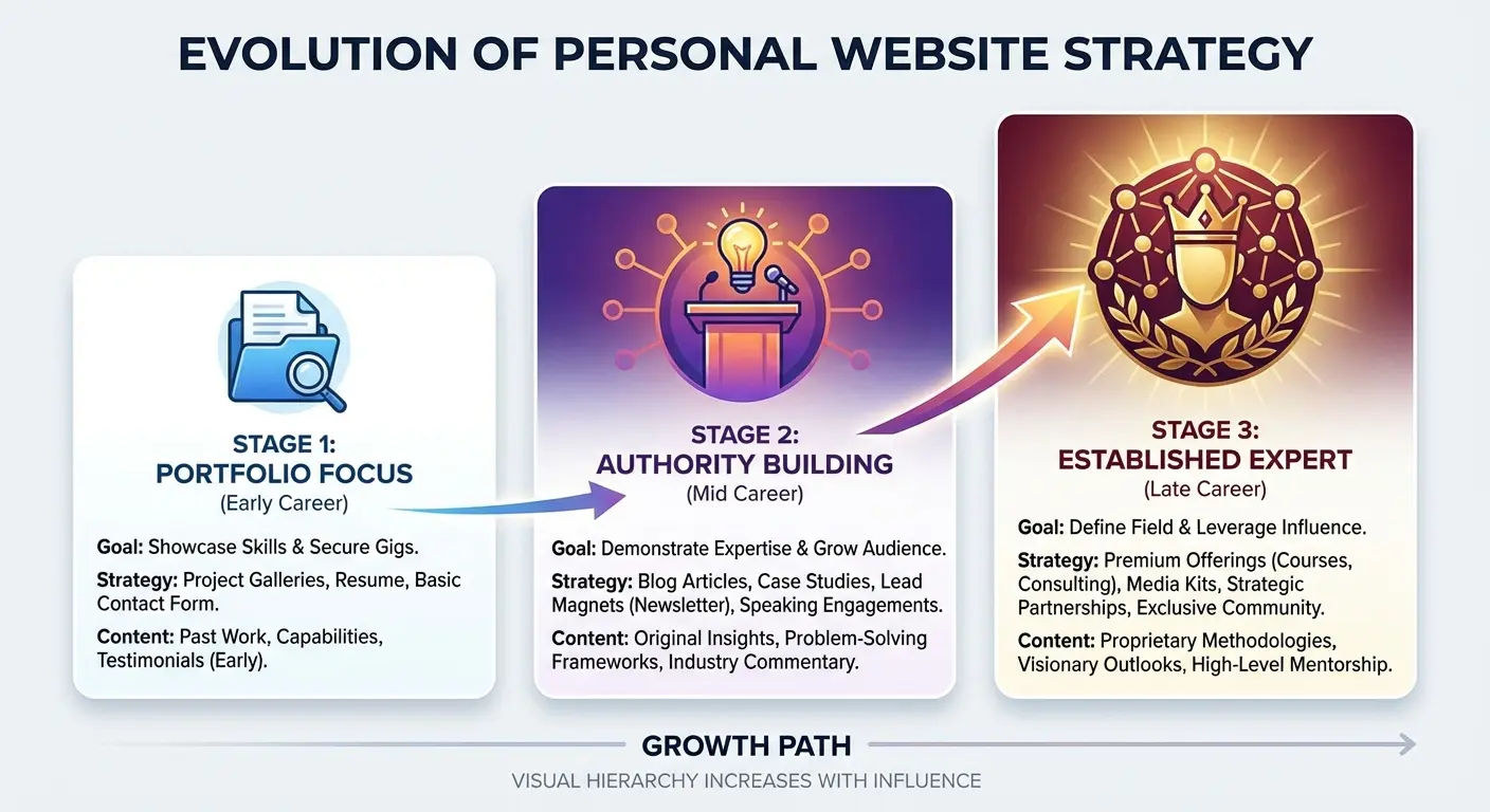
The sites making money? They picked ONE goal and built everything around it. Portfolio, authority, or service. Not all three.
Portfolio sites need conversion architecture, not just pretty work samples. Authority sites work best when they position you as a resource, not a resume. Service-based personal websites should pre-qualify leads and filter out bad-fit clients before the first email.
Your personal site isn’t a digital business card anymore. It’s your highest-leverage sales asset.
Why Most Personal Websites Miss the Mark (And What Actually Converts)
I’ve looked at hundreds of these sites. Talented people, gorgeous designs, zero clients.
The pattern’s depressing: a designer spends 6 weeks perfecting their portfolio, launches it, gets compliments from other designers, and… crickets. No inquiries. No projects. Just a pretty site that does nothing.
The problem isn’t design quality. It’s strategic confusion.
Most people approach their personal website as a digital resume or portfolio dump, when it should function as a conversion tool with a singular purpose. You’re either positioning yourself as an authority, showcasing work to land clients, or selling a specific service. Pick one. The personal website examples I’ve studied that generate measurable business outcomes all share one trait: they know exactly what action they want visitors to take, and every element on the page pushes toward that outcome.

This isn’t about following trends or copying what looks good on Awwwards. It’s about understanding your visitor’s intent and removing every obstacle between their arrival and your desired conversion. A strong personal website can be your online portfolio, digital business card, and brand statement all in one, putting you in control of your story, your visuals, and how people engage with your work (Figma).
According to research on high-performing content assets, statistics pages from established brands like Spotio have earned links from over 800 referring domains, demonstrating that strategic content built around audience needs consistently outperforms aesthetic-focused approaches when it comes to generating measurable business outcomes. Your visitors don’t care how many hours you spent perfecting that hover animation. They care whether you can solve their problem.
The personal website examples I’m breaking down aren’t just visually appealing (though many are). They’re strategically sound, and that’s what makes them worth studying. Each one makes deliberate choices about what to show, what to hide, and what action matters most.
Portfolio Sites That Sell Before They Show
1. Sean Halpin’s Conversion-First Design Portfolio
Halpin breaks the first rule of designer portfolios: he doesn’t lead with his prettiest work.
Instead, his homepage talks about your problems. Blown budgets, scope creep, designers who ghost you after the deposit. Only after he’s called out every pain point do you see a single case study.
His project pages don’t just showcase visual work. They walk through business problems, strategic decisions, and measurable outcomes. Each case study includes client testimonials positioned at the moment of maximum doubt, right before the CTA.
Here’s why this works: it mirrors the buying journey happening in your prospect’s head. They don’t care about your Dribbble shots until they trust you can solve their specific problem. Halpin’s portfolio pre-empts objections and builds confidence systematically.
The result? His inquiry form includes budget ranges and project scope questions, which means he’s pre-qualifying leads before wasting time on discovery calls. No more tire-kickers asking for quotes on projects they can’t afford.
Backwards? Maybe. Effective? His inquiry form now filters out broke clients before they waste his time.
|
Traditional Portfolio Approach |
Conversion-First Portfolio Approach |
|---|---|
|
Leads with visual work samples |
Leads with client pain points and solutions |
|
Case studies focus on design process |
Case studies focus on business outcomes |
|
Testimonials buried at bottom |
Testimonials positioned at objection points |
|
Generic contact form |
Pre-qualifying inquiry form with budget ranges |
|
Visitors leave to “think about it” |
Visitors self-qualify before first contact |
2. Robby Leonardi’s Interactive Resume Experience
Leonardi built an interactive, game-style resume that’s been featured everywhere from Awwwards to Forbes.
Hot take: it gets way more press than it deserves.
Yes, it’s impressive. But it’s also slow-loading and doesn’t work on half of mobile devices. For every person who loves it, three bounce.
That said, here’s what most people miss when they analyze it: the interactivity isn’t a gimmick. It’s a demonstration of technical skill and creative problem-solving in real time. You’re not just reading about his abilities as a designer and developer. You’re experiencing them. The site functions as both portfolio and proof of concept, which collapses the trust-building process dramatically.

For creative professionals, this personal website design approach works when your target clients value innovation and technical execution. It doesn’t work if you’re positioning yourself as a reliable, process-driven operator. Different audience, different strategy.
The key lesson here isn’t “make your site interactive.” It’s “make your site demonstrate the exact skills your ideal client is hiring you for.” If you’re a motion designer, your site should move. If you’re a copywriter, your site should sell through words alone. If you’re a UX designer, your site should be frictionless and intuitive.
Show, don’t tell.
3. Adham Dannaway’s Split-Screen Personality Test
Dannaway’s homepage presents visitors with a choice: view him as a designer or as a developer.
The split-screen interface immediately segments his audience and delivers relevant portfolio work based on their selection. This is smart positioning for multi-disciplinary professionals who serve distinct client types. Instead of diluting his message by trying to appeal to everyone at once, he acknowledges the segmentation upfront and tailors the experience accordingly.
The strategy here? Reducing cognitive load.
When visitors land on your site, they’re asking “Is this person right for me?” Dannaway answers that question in one click. His case studies are then filtered and framed through the lens of the visitor’s initial choice, which increases relevance and engagement throughout the browsing experience.
This ranks among the best personal website examples for professionals with multiple skill sets. If you’re a designer who codes, a writer who consults, or a developer who does UX, you face the same challenge: how do you speak to different audiences without confusing everyone? Dannaway’s approach solves it elegantly and serves as a good personal website model for anyone managing multiple service offerings.
4. Brittany Chiang’s GitHub-Integrated Developer Portfolio
Chiang’s portfolio is a masterclass in credibility-building for developers.
She integrates her GitHub activity directly into her site, displaying recent commits, active projects, and contribution graphs. This isn’t just showing work. It’s proving consistent output and technical engagement in real time. For developers and engineers, GitHub integration serves as third-party validation that can’t be faked or exaggerated.

Her project descriptions focus on technical challenges and solutions rather than visual presentation, which aligns perfectly with how technical hiring managers evaluate candidates. The site also includes a clean, scannable resume section optimized for ATS systems, acknowledging that many visitors will be recruiters or hiring managers looking for specific keywords and qualifications.
This dual-purpose approach (human-friendly portfolio plus machine-readable resume) is increasingly important as AI tools screen candidates before human eyes ever see them. It’s one of the most effective personal website examples for technical professionals because it speaks both languages fluently.
5. Bestfolios’ Minimalist Case Study Framework
Bestfolios, run by designer Oliur Rahman, showcases a curated collection of design portfolios. His own site demonstrates a principle worth stealing: extreme minimalism in case study presentation.
Each project gets a single hero image, a brief description (3-4 sentences max), and a link to view more.
That’s it.
No lengthy process breakdowns on the homepage. No walls of text explaining design decisions.
This approach respects the visitor’s time and acknowledges a truth most portfolio sites ignore: people skim. They’re looking for visual proof of quality and style alignment before they invest time in reading detailed case studies. Bestfolios’ framework works because it optimizes for the browsing behavior that actually happens, not the deep engagement we wish would happen.
Once someone clicks into a project, then you can provide depth. But the homepage needs to facilitate quick pattern recognition: “Does this person’s aesthetic and client roster match what I’m looking for?” Answer that question fast, or they’re gone.
Authority Sites That Position, Not Promote
6. Tim Ferriss’ Blog-as-Business-Card Model
Ferriss’ personal site is essentially a content hub with minimal self-promotion.
The primary real estate is dedicated to his podcast, blog posts, and tools he recommends. His about page is brief and focused on credibility markers (bestselling books, notable podcast guests, media features) rather than personal narrative.
Here’s the thing nobody talks about: there’s no aggressive email capture on the homepage, no sales funnels for courses, no consulting inquiry forms. The site assumes you already know who Tim Ferriss is, and it’s structured to serve existing fans rather than convert cold traffic.
This approach only works when you’ve already built significant authority elsewhere. Don’t try this if you’re new. You’ll look lazy, not minimalist.
But it’s a reminder that your personal websites should evolve as your career does. What works when you’re hustling for clients won’t work when you’re fielding inbound opportunities.
7. Ann Handley’s Content-First Personal Brand
Handley’s site prioritizes her newsletter and blog content above everything else.
The homepage features recent articles with compelling headlines and excerpts designed to pull you into reading. Her navigation is simple: Writing, Speaking, About, Newsletter. That’s it. No service offerings, no consultation booking, no product sales.
The strategy here is pure authority positioning. She’s not trying to convert visitors into clients. She’s reinforcing her position as a thought leader in content marketing, which indirectly drives speaking opportunities, book sales, and advisory roles. The email signup is present but not aggressive, positioned as “join the conversation” rather than “get my free guide.”
This softer approach to list building works when your content quality is high enough to stand on its own merit. If you’re building authority in a specific niche, your site should feel like a resource, not a sales page. For professionals looking to build authority through content, exploring high-impact blog topics can help you create the kind of valuable resources that position rather than promote.
This represents one of the more effective personal website examples for thought leaders who monetize through speaking, books, and high-level advisory work rather than client services.
8. Seth Godin’s Anti-Design Philosophy Site
Godin’s site looks like it’s from 2005.
Because it is. And that’s the entire point.
It’s deliberately bare-bones: a simple blog with minimal formatting, no images, and typography that looks unchanged since the Bush administration. This isn’t neglect. It’s strategic positioning. The lack of design polish communicates “I don’t need to impress you with aesthetics because my ideas speak for themselves.”

It’s also a filtering mechanism. If you’re put off by the basic design, you’re probably not his audience. His readers come for insight, not visual stimulation.
The site’s structure reinforces his daily blogging commitment. Every post is timestamped and displayed chronologically, which builds credibility through demonstrated consistency. There’s no email capture popup, no social sharing buttons, no comment section.
Just ideas, published daily, for over two decades.
Unpopular opinion: Seth Godin’s ugly site only works because he’s Seth Godin. If you try this as a freelancer, you’ll just look cheap. But it’s a reminder that once you’ve built authority, stripping away everything non-essential can strengthen your message rather than weaken it.
9. Marie Forleo’s Video-Centric Hub
Forleo’s personal site is built entirely around video content, specifically her MarieTV series.
The homepage features her latest video prominently, with clear CTAs to watch, subscribe, and join her email list. Unlike text-based authority sites, this approach leverages video’s ability to build parasocial relationships quickly. Visitors get immediate exposure to her personality, communication style, and teaching approach.
I’m biased (I’m a reader, not a w atcher), but I can’t argue with her results.
The site architecture funnels people from free video content to paid programs (B-School, Time Genius), with clear progression paths for different audience segments. The consistency between content format and business model makes strategic sense. She’s not selling consulting or services. She’s selling courses and programs that require trust and personality alignment. Video content builds both faster than text.
The site also features strong social proof (testimonials, media logos, community size) positioned at key decision points throughout the user journey. This makes it one of the best personal websites for course creators who need to establish trust and personality fit before asking for high-ticket purchases.
10. James Clear’s Newsletter Acquisition Machine
Clear’s site has one primary goal: convert visitors into email subscribers.
The homepage features a massive email signup form above the fold, with clear value proposition copy: “Join 1 million+ readers getting the 3-2-1 newsletter.” Below that, recent articles are displayed to provide value and build credibility, but the architecture makes it clear that email signup is the desired action.

This strategy works because Clear’s business model (book sales, speaking, licensing) benefits from a large, engaged email list more than direct client work or course sales. His articles are substantial and valuable, which reduces the friction of giving up an email address.
The site also employs smart psychological tactics: displaying subscriber count (social proof), keeping the signup form visible as you scroll (persistent CTA), and using a clear value proposition (you’ll get specific content on a predictable schedule). Recent analysis from WebsitePlanet confirms this newsletter-first strategy is gaining traction, noting that “when it comes to personal branding, having your own website can make a bigger impact than any social media profile ever could,” particularly when the site prioritizes email list building over scattered social media engagement (WebsitePlanet, 2025).
James Clear’s newsletter-first approach sounds great until you realize you need to write weekly for 2 years before it pays off. Most people quit at month 4.
But if you’ve got the stamina? For writers, speakers, and authors, this newsletter-first approach often generates more long-term business value than a traditional portfolio or service site. Understanding email marketing case study results can help you optimize your personal websites for newsletter acquisition rather than direct sales.
11. Austin Kleon’s Visual Journal Approach
Kleon’s site functions as a public creative journal, featuring sketches , photographs, book recommendations, and short written pieces. It’s not trying to sell you anything directly.
Instead, it demonstrates his creative process and thinking in real time, which builds affinity with his audience and reinforces his brand as a creative generalist. The site’s informal, blog-style format makes it feel accessible and human rather than polished and corporate.
I love Kleon’s messy, journal-style site. It feels human in a way most portfolios don’t.
This approach works particularly well for creatives whose business model includes book sales, speaking, and workshops rather than client services. The site serves as proof of consistent creative output and original thinking, which are the core products he’s selling, even if no direct sales happen on the site itself.
The RSS feed is prominently featured, acknowledging his audience’s preference for following via feed readers rather than email or social media. This small detail shows strategic awareness of who his audience is and how they prefer to consume content.
Sometimes the best strategy is building in public without asking for anything in return.
Service Sites That Pre-Qualify and Convert
12. Paul Jarvis’ Single-Service Landing Page
Jarvis’ site is structured as a long-form sales page for his newsletter and courses, but the specificity is what makes it effective.
The headline immediately identifies his audience (“For independent creative professionals”) and his value proposition (“Build a better business”). The page includes clear benefit statements, social proof, and a simple email signup.
You’re probably thinking: “But I need to show my range!” No, you don’t. You need to show you can solve one problem really well.
Here’s what’s missing: no portfolio, no about page rambling about his journey, no blog archive. Just a focused pitch for one thing. This works when you’ve identified a specific service or product that generates most of your revenue, and you’re willing to optimize entirely for that conversion.
The strategy requires confidence and clarity about your business model. Most people aren’t willing to be this focused because they’re afraid of leaving money on the table. But diffused focus usually generates worse results than concentrated effort on a single, well-defined offer.
|
Site Element |
Multi-Purpose Approach |
Single-Service Approach |
|---|---|---|
|
Headline |
Generic “Welcome to my site” |
Specific audience + value proposition |
|
Navigation |
7+ menu items |
3 or fewer focused links |
|
Content Focus |
Portfolio + blog + services + about |
One primary conversion path |
|
Visitor Confusion |
High (multiple CTAs compete) |
Low (one clear next step) |
|
Conversion Rate |
Diluted across options |
Concentrated on primary goal |
13. Brennan Dunn’s Email Course Gateway
Dunn’s site uses a free email course as the primary conversion mechanism.
The homepage explains the problem (freelancers and consultants undercharging and struggling to find clients), presents the solution (his methodology), and offers a free email course as the entry point. This strategy works because it pre-qualifies leads. People who complete a multi-day email course are more engaged than random newsletter subscribers.

The course itself serves as both education and sales funnel, gradually introducing his paid products and services. The progression makes sense: free content builds trust, email course deepens engagement and demonstrates expertise, paid products become the logical next step.
The site architecture supports this funnel by keeping the focus narrow. There’s no blog distracting from the main conversion path. No portfolio or case studies creating decision paralysis. Just a clear value proposition and a single, compelling CTA.
This makes it one of the most effective personal website examples for consultants who sell methodology and expertise rather than hourly services.
14. Tiffany Han’s Coaching Qualifier Quiz
Han’s site uses an interactive quiz as the primary engagement tool.
The quiz promises to help visitors identify their “creative block type” and provides personalized recommendations based on their answers. This approach does several things simultaneously: it engages visitors with interactive content, collects email addresses, segments the audience based on their responses, and positions Han as an expert who understands nuanced problems.
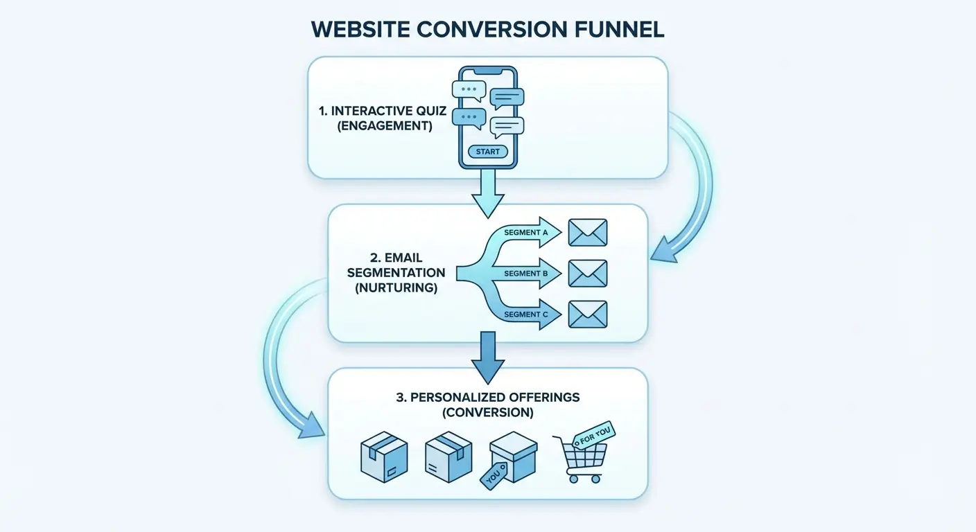
The quiz results page includes tailored content and relevant service offerings, which dramatically increases conversion rates compared to a generic homepage pitch.
The quiz thing feels gimmicky to me. But my personal taste doesn’t matter because it converts, so it works.
For coaches, consultants, and service providers dealing with diverse client needs, this quiz-based approach solves the segmentation problem elegantly. Instead of trying to speak to everyone at once and resonating with no one, you can deliver personalized messaging based on self-reported information.
Similar interactive content strategies have proven effective across industries. PureGym’s “UK Fitness Report” statistics page has earned links from over 500 referring domains by combining interactive elements with valuable data, demonstrating that engagement-focused website features consistently outperform static content when it comes to both user interaction and organic link acquisition.
The key is making the quiz genuinely valuable rather than a thinly veiled data collection tool.
15. David Perell’s Course Ecosystem Site
Perell’s site is structured around his flagship course (Write of Passage) but includes substantial free content that feeds into the course funnel.
The homepage features his podcast, essays, and newsletter alongside clear CTAs for the course. His free content demonstrates the quality of thinking and teaching you’ll get in the paid course, which reduces purchase friction.
The site also employs strong social proof (student testimonials, notable alumni, media features) and addresses common objections through FAQ sections and detailed course information. For educators and course creators, this model works because it acknowledges the high-ticket nature of the product. The course costs thousands of dollars, so you can’t sell it with a single landing page.
You need an ecosystem of content that demonstrates value, builds authority, and creates multiple touchpoints before someone’s ready to buy. Course creators can benefit from understanding marketing case study examples that demonstrate how content ecosystems drive high-ticket sales.
This comprehensive approach makes it one of the best personal websites for high-ticket course creators. When exploring personal website ideas, this ecosystem model offers a proven framework for building trust before asking for significant investment.
16. Wes Bos’ Product Portfolio with Social Proof
Bos’ site showcases his various coding courses with a focus on social proof and specificity.
Each course has student counts, testimonials, and clear learning outcomes. The design is clean and developer-friendly: fast loading, no unnecessary animations, clear information hierarchy.
The transparency builds trust. Course content, pricing, and student numbers are all clearly displayed, which reduces purchase anxiety. The site also features free tutorials and resources, which serve as both lead generation tools and product samples.
For product-based businesses (courses, templates, tools), this approach works because it treats your personal site as an e-commerce platform rather than a branding exercise. The focus is on conversion optimization: clear product benefits, visible social proof, reduced friction in the purchase process, and ample free samples to demonstrate quality before asking for money.
This offers valuable personal website ideas for anyone selling digital products. You’re not trying to impress people with your design skills. You’re trying to make buying easy, transparent, and low-risk.
Look, if this feels overwhelming (picking a strategy, restructuring your site, figuring out what converts), that’s literally what we do at The Marketing Agency. We’ve built 200+ of these sites. At The Marketing Agency, we help professionals and businesses build digital presences rooted in data and strategic clarity rather than guesswork. We can analyze your target audience, map out conversion paths that align with your business model, and implement tracking systems that show you exactly what’s working. Book a free strategy call and we’ll give you an honest assessment of what your site needs to generate real business outcomes.
Final Thoughts
Last week a client called me after redoing her site using these principles. First words: “I got three inquiries in two days. What the hell happened?”
The personal website examples that generate business results share a common thread: they’re built with strategic intent, not aesthetic aspiration.
Every example I’ve covered makes deliberate choices about what to show, what to hide, and what action to prioritize. Your personal website isn’t a creative expression project (unless you’re specifically selling creative services and using the site as a demonstration piece). It’s a business tool that should either position you as an authority, showcase relevant work to attract ideal clients, or convert visitors into leads for your services.
I know what you’re going to say: “My work is too diverse to pick one focus.” That’s not a feature, it’s a positioning problem.
The biggest mistake I see is trying to do all three simultaneously, which results in a confused mess that accomplishes none of them well. Choose your primary purpose, build your site architecture around that single goal, and ruthlessly cut everything that doesn’t support it.
Whether you’re looking for personal website examples for students just starting out or established professionals refining their approach, the principle remains the same: strategy beats design every time. The best personal website examples aren’t the ones that win design awards. They’re the ones that generate consistent business results while you sleep, and that only happens when strategy drives every decision from navigation structure to CTA placement.
Honestly? Most of you won’t do this. You’ll keep your pretty, useless site because it feels safer than picking a strategy and committing.
That’s fine. More clients for the people who actually execute.