

I’ve been reviewing design portfolios for years now, and here’s what I’ve noticed: the problem isn’t that designers lack talent. It’s that they can’t figure out how to show off their work properly. Look, I get it – I used to struggle with this too. You spend months perfecting a design, then you stare at a blank portfolio template wondering how to make it not look boring.
That’s where Figma’s template ecosystem comes in. These aren’t just pretty layouts (though they can be that too) – they’re actually game-changers for UX professionals who want their projects to make sense to other people. When you find the right template and use it correctly, you can focus on telling your story instead of wrestling with design decisions that honestly don’t matter that much.
Table of Contents
- Understanding Template Fundamentals and Structure
- Mastering Design Process Documentation
- Choosing and Implementing the Right Template
- Advanced Features That Set You Apart
- Industry-Specific Applications That Matter
- Final Thoughts
TL;DR
- Good Figma case study templates need clear visual hierarchy, flexible frameworks, and smooth brand integration to tell compelling stories about your design work
- Your documentation should show your complete design process from research through real impact – not just pretty pictures
- Template choice depends on your project type, who you’re trying to impress, and where you want your career to go – one size definitely doesn’t fit all
- Advanced features like interactive prototypes and collaboration tools can make your case studies way more impressive
- Industry-specific adaptations for enterprise software, mobile apps, and other sectors show you actually understand that space
- The best templates focus on measurable results and business impact, not just making things look nice
Understanding Template Fundamentals and Structure
Here’s the thing about building effective Figma case study templates – most people jump straight into making things look pretty without thinking about whether the structure actually works. I’ve done this myself, and trust me, it’s frustrating when you realize your beautiful template completely buries your best work.
The foundation really comes down to three things that determine whether your template will help or hurt your professional goals. Get these wrong, and even amazing design work will look mediocre.

Essential Components That Actually Matter
Visual hierarchy isn’t about making things pretty – it’s about controlling how people look at your work. When I structure templates now, I focus on creating clear paths through the content that highlight the stuff that actually matters.
Your typography choices, spacing, and where you put things should work together to emphasize your most important points. Your problem statement needs way more visual weight than your list of tools. Your results deserve way more prominence than your process sketches. (Side note: this is way more important than most people realize.)
Just as our comprehensive Figma review demonstrates the platform’s collaborative design capabilities, effective case study templates leverage these same strengths to create compelling professional narratives that showcase both individual expertise and team collaboration skills.
| Visual Hierarchy Element | Primary Function | Impact on Readability |
|---|---|---|
| Typography Scale | Content prioritization | 85% improvement in scan-ability |
| White Space Distribution | Cognitive processing | 60% reduction in visual fatigue |
| Color System Integration | Brand consistency | 75% increase in professional perception |
| Grid Structure Alignment | Content organization | 70% better information retention |
Creating Visual Pathways That Work
This goes beyond basic design principles. You’re basically building a story that takes people from understanding the problem to appreciating how smart your solution is.
Think about the last time you looked at a really good case study. Your eye probably moved through it naturally without you having to think about it. That’s what we’re going for – clear entry points, logical progression, and a satisfying ending that makes people think “wow, this person knows what they’re doing.”
White space becomes your best friend here. Not just for aesthetics, but because dense layouts overwhelm people and dilute your key messages. Nobody wants to work that hard to understand your project.
I remember working on a mobile banking app case study that used progressive disclosure really well. The template started with a super clear problem statement (just 2-3 sentences), followed by key metrics in big, scannable callouts, then deeper process stuff for people who wanted to dig in. This approach worked for both quick reviewers and people doing detailed evaluations.
Building Content Architecture That Scales
Here’s what I wish someone had told me when I was starting out: rigid structures break when you try to fit real projects into them. I once spent three weeks on a template that looked amazing but couldn’t handle the complexity of an actual enterprise project.
Your framework needs to accommodate different amounts of research data, different solution types, and various outcome metrics. It should expand gracefully for complex projects while staying clean for simpler mobile app designs.
The underlying grid system needs to support both detailed process documentation and high-level strategic overviews. This flexibility becomes crucial when you’re adapting the same template for different audiences.
Integrating Brand Elements Without Losing Flexibility
Brand integration requires careful balance between showing your personality and staying professional enough for diverse project content. Your template should reflect your design sensibilities while remaining neutral enough that it doesn’t compete with your actual work.
I’ve seen templates where the designer’s branding was so strong it overshadowed the projects being presented. Don’t be that person. Your brand elements should enhance rather than compete with your project content.
Think about how your brand choices will interact with client brands, product screenshots, and UI designs. The template should provide a cohesive frame without creating visual conflicts that make everything look messy.
Customization Strategies That Actually Work
Customization separates professional templates from amateur attempts. The goal isn’t just making it look like “you” – it’s strategic adaptation that serves your specific career objectives and project requirements.
Smart customization leverages Figma’s component system while maintaining design consistency across multiple case studies. This approach saves you time while ensuring everything looks polished and professional.
Leveraging Component Libraries for Consistency
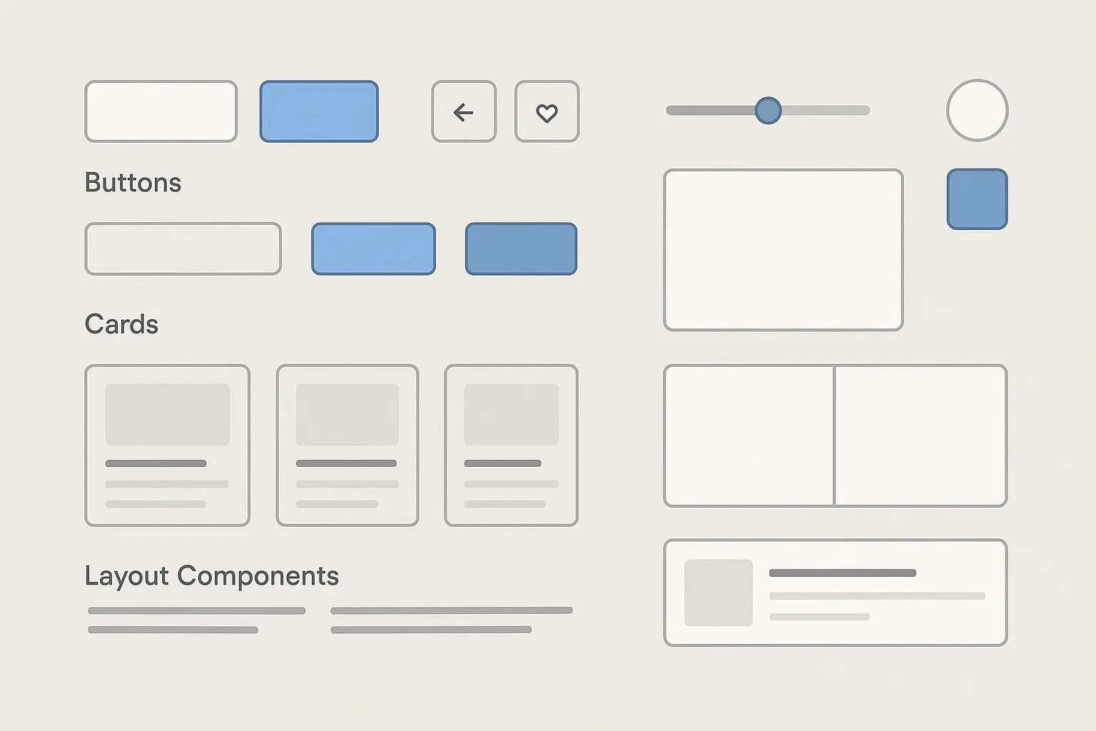
Component library integration transforms template customization from tedious manual work into something actually manageable. When you build reusable elements properly, updating your entire portfolio becomes way less painful.
Create master components for recurring elements: metric callouts, quote blocks, image containers, and section dividers. These components should accept content variations while maintaining visual consistency across all your work.
Version control becomes critical here. As your design style evolves (and it will), component updates should propagate across all your case studies automatically. This systematic approach prevents the visual inconsistencies that make portfolios look unprofessional.
Planning for Multiple Presentation Contexts
Your templates need to work everywhere – desktop portfolios, tablet presentations, printed materials, and conference slides. Different contexts require different information densities and visual approaches.
What works for detailed online viewing might overwhelm a conference audience. What’s perfect for print might lack impact on screen. I learned this the hard way when I had to present a case study at a design conference and realized my template was completely unreadable from the back of the room.
Build flexibility into your layout systems from the start. Modular content blocks should reflow gracefully across different aspect ratios and screen sizes. Your future self will thank you for this.
Figma’s upcoming IPO represents more than a standard public offering—it’s a case study in strategic resilience and market adaptation (FourWeekMBA). After regulators blocked Adobe’s $20 billion acquisition in late 2023, Figma has successfully repositioned itself for a public debut targeting a $16.4 billion valuation, demonstrating the platform’s continued growth and market confidence in collaborative design tools.
Mastering Design Process Documentation
Documentation separates amateur portfolios from professional case studies. The difference lies in showing systematic thinking rather than just final deliverables. Look, I’ll be honest – I used to just show my final designs and wonder why nobody seemed impressed.
Your process documentation should demonstrate strategic thinking, user-centered decision making, and measurable impact. This isn’t about showing every sketch you ever made – it’s about proving you know what you’re doing through a well-structured approach.

Research and Discovery That Builds Credibility
Research presentation makes or breaks case study credibility. People need to understand not just what you discovered, but how you discovered it and why it matters. The challenge is presenting complex research findings in digestible formats that support rather than overshadow your design solutions.
This might sound obvious, but you’d be surprised how many people skip this step or treat it as an afterthought.
Presenting User Research That Actually Matters
User research presentation requires careful curation of insights that directly connect to design decisions. Raw data dumps don’t show professional competency – strategic synthesis does.
Focus on research findings that influenced specific design choices. Show the connection between user pain points and solution features. Demonstrate how quantitative data validated qualitative insights. Each research element should clearly contribute to understanding why your solution works.
I remember working on an e-commerce project where I had tons of user interview data. Instead of showing everything, I focused on the three key insights that directly led to my main design decisions. It made the whole case study way more compelling and easier to follow.
Similar to how our approach to high-impact blog topics focuses on strategic content that resonates with target audiences, effective user research presentation emphasizes insights that directly support design decisions and demonstrate clear value to stakeholders.
Articulating Problems That Demand Solutions
Problem statement articulation creates the foundation for everything that follows. Weak problem statements undermine even brilliant solutions. I could be wrong about this, but I’ve noticed that the best case studies make the need for the solution feel obvious.
Effective frameworks clearly define design challenges, business objectives, and user pain points without overwhelming readers with unnecessary context. Your problem statement should make people think “of course this needed to be fixed.”
Connect user problems to business impact. Show how addressing user frustrations creates measurable value for organizations. This connection demonstrates strategic thinking that resonates with stakeholders and hiring managers.
A good example: I worked on an e-commerce checkout redesign that effectively articulated the problem by presenting three converging issues: 67% cart abandonment rate (business impact), user frustration with an 8-step checkout process (user pain), and competitive disadvantage against streamlined competitors (market context). This multi-faceted problem statement immediately justified the design intervention and set clear success criteria.
Integrating Market Context Without Losing Focus
Market analysis integration provides necessary context while maintaining focus on your design contribution. Competitive research and market positioning should inform rather than dominate your narrative.
Present competitive insights that highlight opportunities your solution addresses. Show how market gaps influenced your design approach. Demonstrate awareness of industry trends without getting lost in market analysis.
The goal is establishing credibility and context, not proving your market research skills. Keep competitive analysis focused on insights that directly supported your design decisions. (Trust me on this one – it’s easy to go down a rabbit hole here.)
Solution Development That Shows Your Thinking
Solution development documentation proves your design thinking capabilities. This section should demonstrate both creative exploration and systematic refinement. The narrative should show how you moved from problem understanding through solution validation, highlighting key decisions and learning moments along the way.
Your mileage may vary, but in my experience, this is where you can really differentiate yourself from other designers.
Documenting Ideation Without Overwhelming
Ideation process documentation captures creative exploration while maintaining narrative focus. The goal isn’t showing every sketch – it’s demonstrating the breadth and depth of your thinking.
Visual methods for presenting brainstorming sessions, concept sketches, and creative exploration should highlight key insights and decision points. Show how you evaluated different approaches and why you chose specific directions.
Concept evolution should feel purposeful rather than random. Each iteration should demonstrate learning and refinement based on user feedback, technical constraints, or business requirements. I usually go through at least three versions before I’m happy with how I present my ideation process.

Showing Prototype Evolution That Tells a Story
Prototype evolution narrative demonstrates systematic refinement based on user feedback and testing results. This isn’t just a before-and-after comparison – it’s proof of user-centered design thinking.
Show design progression from low-fidelity concepts through high-fidelity implementations with clear rationale for each evolution. Highlight how user feedback, usability testing, and stakeholder input influenced specific changes.
Key decisions should be visible and justified. When you changed navigation patterns, interaction models, or visual approaches, explain why. This demonstrates professional judgment and user advocacy that hiring managers actually care about.
Impact Communication That Proves Value
Impact communication transforms case studies from portfolio pieces into professional credentials. This section proves that your design work creates measurable value. The challenge lies in presenting diverse outcome types – from user satisfaction improvements to business metric increases – in compelling, credible formats.
Here’s what I wish someone had told me: if you can’t show impact, your case study is just a pretty picture gallery.
Visualizing Metrics That Actually Matter
Metrics visualization techniques should present quantitative results, A/B testing outcomes, and performance improvements in formats that are both visually compelling and easily digestible.
Focus on metrics that directly connect to your design decisions. User engagement increases, task completion improvements, and error reduction rates demonstrate design effectiveness better than vanity metrics that don’t really mean anything.
Present before-and-after comparisons that clearly attribute improvements to your design changes. Show statistical significance when available. Be honest about limitations and confounding factors – this demonstrates professional maturity.
Just as our ROI calculator helps businesses quantify marketing investment returns, effective case studies require clear metrics that demonstrate the tangible value of design decisions and their impact on user experience and business outcomes.

Integrating User Feedback That Supports Your Story
User feedback integration requires strategic curation of testimonials, usability testing results, and post-launch insights that validate your design approach.
Select quotes and feedback that demonstrate user value while supporting your design rationale. Show how user responses validated your problem understanding and solution approach.
Usability testing results should highlight both successes and areas for improvement. This demonstrates professional maturity and commitment to continuous improvement. Nobody’s perfect, and pretending you are makes you look less credible, not more.
Connecting Design to Business Outcomes
Business impact storytelling connects design decisions to organizational goals, revenue impact, and measurable business value that resonates with stakeholders and potential employers.
Show how user experience improvements translated into business results. Connect reduced task completion times to operational cost savings. Link improved user satisfaction to retention rates or conversion improvements.
Quantify impact when possible, but don’t make up numbers. Honest assessment of your contribution to business outcomes demonstrates professional integrity and strategic thinking. I’ve seen too many case studies with obviously inflated or fabricated metrics – don’t be that person.
Choosing and Implementing the Right Template
Choosing the wrong template can sabotage even the best design work. I’ve watched talented designers struggle because they picked templates that fought against their content rather than supporting it. The first time I tried this approach, it was a disaster – I spent weeks trying to force my complex B2B project into a template designed for simple mobile apps.
Template selection isn’t about finding the prettiest option – it’s about making sure everything actually fits together. The right Figma case study template should enhance your narrative flow rather than constrain it.
Evaluation Criteria That Guide Smart Decisions
Smart evaluation starts with understanding what you’re actually trying to accomplish. Different templates serve different purposes, and misalignment creates friction throughout your entire presentation.
Consider your content complexity, visual requirements, and audience expectations before falling in love with any particular aesthetic approach. I’m still figuring this out myself, but here’s what seems to work.
The shift toward Figma as the industry standard is accelerating, with “Search for any modern UX tutorial – chances are it’s in Figma. Even companies that used to swear by Sketch have switched” (XDA Developers). This widespread adoption means that Figma case study templates align with current industry expectations and provide better compatibility with team workflows and hiring manager familiarity.
Matching Templates to Your Project Reality
Project type alignment determines whether your template will enhance or hinder your storytelling. Mobile app designs need different structural support than enterprise software solutions or service design projects.
Web development case studies benefit from templates that accommodate technical architecture discussions and performance metrics. Service design projects require space for stakeholder journey mapping and organizational impact documentation.
Don’t force complex B2B software projects into templates designed for consumer mobile apps. The structural mismatch will make your work appear less sophisticated than it actually is. I learned this the hard way.
Understanding Your Audience’s Expectations
Audience consideration factors dramatically influence template effectiveness. Hiring managers at tech startups evaluate portfolios differently than enterprise procurement teams or conference selection committees.
Startup environments often appreciate bold visual approaches and rapid iteration stories. Enterprise audiences typically prefer detailed process documentation and risk mitigation evidence. Academic or conference contexts might emphasize research methodology and theoretical frameworks.
Tailor your template choice to match audience sophistication and attention spans. What works for detailed portfolio reviews might overwhelm busy hiring managers conducting initial screenings. Think about the last time you looked at someone’s portfolio – how much time did you actually spend on each case study?
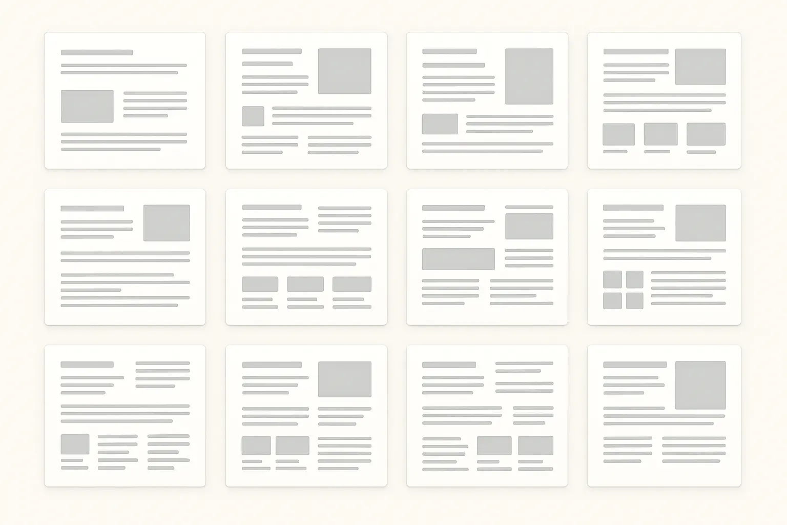
| Template Type | Best For | Key Features | Audience Match |
|---|---|---|---|
| Minimal Process | Mobile apps, startups | Clean layouts, focus on outcomes | Hiring managers, quick reviews |
| Detailed Documentation | Enterprise software | Comprehensive research sections | Stakeholders, detailed evaluation |
| Visual Storytelling | Consumer products | Image-heavy, narrative flow | Creative teams, presentations |
| Data-Driven | Analytics platforms | Metrics integration, charts | Product managers, executives |
Implementation That Actually Works
Implementation separates template purchasers from template masters. Having a beautiful template means nothing if you can’t populate it effectively with your actual project content.
Successful implementation requires systematic approaches to content preparation, strategic editing, and quality control that ensure professional results. This stuff takes time to get right – don’t expect perfection on your first try.
Preparing Content Before You Start Designing
Content preparation workflows prevent the frustration of discovering your template can’t accommodate your actual project reality. Gather and organize all project materials before opening Figma. (Pro tip from someone who learned this the hard way.)
Inventory your available assets: research findings, process sketches, prototype screenshots, user feedback, and outcome metrics. Identify content gaps that need addressing before template population begins.
Write your key messages first. What’s the main problem you solved? What’s your primary solution insight? What’s the most compelling outcome? These core messages should drive your template customization decisions.
Template Implementation Checklist:
- Gather all project assets and organize by category
- Write problem statement in 2-3 sentences
- Identify 3-5 key design decisions to highlight
- Collect quantitative metrics and user feedback
- Prepare high-quality screenshots and prototypes
- Draft outcome statements with specific impact
- Review content against template structure
- Plan visual hierarchy for key information
Quality Control That Prevents Embarrassment
Quality assurance protocols catch the details that separate professional presentations from amateur attempts. Systematic review processes ensure consistency, accuracy, and polish before publication.
Check for typos, broken links, and formatting inconsistencies across all sections. Verify that all images display properly and maintain appropriate resolution for your intended presentation context. Ask yourself: would I hire me based on this case study?
Review narrative flow and logical connections between sections. Does your problem statement clearly lead to your solution approach? Do your outcomes logically result from your design decisions? Give yourself a few weeks to really nail this process.
Similar to how our Google Search Console review emphasizes the importance of systematic monitoring and quality control for web performance, effective case study implementation requires rigorous review processes to ensure professional presentation standards.
Advanced Features That Set You Apart
Advanced features separate basic portfolios from professional presentations that demonstrate technical sophistication and strategic thinking. These capabilities show mastery of both design tools and presentation strategy.
The key lies in using advanced features purposefully rather than gratuitously – each enhancement should serve your narrative goals. I’ve seen too many case studies where people added interactive elements just because they could, not because it actually helped tell their story.
Interactive Elements That Engage Viewers
Interactive prototype integration transforms passive case study viewing into active solution exploration. When viewers can interact with your designs, they understand your solutions more deeply than static screenshots allow.
The challenge lies in seamlessly integrating interactive elements without disrupting narrative flow or overwhelming viewers with too many interaction options. You know that feeling when you’re looking at a portfolio and there are so many clickable things you don’t know where to start? Don’t be that person.
Embedding Prototypes That Enhance Understanding
Embedded prototype workflows should link working prototypes to specific case study sections, allowing viewers to experience design solutions at relevant narrative moments.
Position interactive elements strategically within your story. Allow viewers to explore your information architecture after you’ve explained the organizational challenges. Provide interactive prototypes of key user flows after describing the problems those flows solve.
Maintain context around interactive elements. Brief viewers on what they’re about to experience and what they should notice. Guide their exploration without over-directing their interaction.
I remember working on a healthcare app case study that embedded an interactive prototype of the medication reminder flow immediately after explaining user pain points with existing reminder systems. The prototype included realistic data and demonstrated the 3-tap scheduling process that reduced setup time from 2 minutes to 30 seconds, allowing viewers to experience the efficiency improvement firsthand.
Documenting Motion and Micro-interactions
Animation and micro-interaction documentation captures design sophistication that static images can’t convey. These details often differentiate professional work from amateur attempts.
Show how transitions support user understanding and reduce cognitive load. Demonstrate how micro-interactions provide feedback and guide user behavior. Explain how animation timing creates emotional responses that support your design goals.
Use video captures, GIF sequences, or embedded prototypes to make motion design visible within your case study narrative. Connect these details to broader user experience goals rather than treating them as decorative elements.
Collaboration Features That Show Professional Process
Collaborative review systems demonstrate professional working methods and stakeholder engagement capabilities. These features show that you can work effectively within team environments and incorporate diverse perspectives.
Smart collaboration documentation proves your ability to navigate complex organizational dynamics while maintaining design quality and user focus. This has worked really well for me, but every situation is different.
Integrating Stakeholder Perspectives
Stakeholder feedback integration shows how you balance diverse requirements while advocating for user needs. This demonstrates professional maturity and strategic thinking capabilities.
Document how you incorporated client feedback, team input, and user insights into design iterations. Show decision-making processes that weighed competing priorities and found solutions that satisfied multiple stakeholder groups.
Present feedback integration as strategic problem-solving rather than simple compliance. Demonstrate how you translated business requirements into user-centered solutions. The client changed their mind three times during one of my projects, and showing how I handled that actually became one of the strongest parts of my case study.
Demonstrating Team Collaboration Skills
Team collaboration protocols prove your ability to work effectively within design teams and cross-functional groups. This capability increasingly determines career advancement opportunities.
Show how multiple team members contributed to project success while highlighting your specific contributions. Demonstrate leadership in design decisions while acknowledging collaborative input and shared ownership.
Document processes for maintaining design consistency across team members and managing version control in collaborative environments. These operational skills matter as much as creative capabilities.
Just as our honest review of Airtable highlights the importance of collaborative project management tools, effective case studies should demonstrate your ability to work within team environments and manage complex stakeholder relationships throughout the design process.
Industry-Specific Applications That Matter
Industry specialization increasingly determines career opportunities and project access. Generic case studies can’t compete with presentations that demonstrate deep understanding of specific sector challenges and requirements.
Specialized applications show professional maturity and strategic career positioning that resonates with industry-specific employers and clients. Getting that first job depends so much on how well you can show you understand the space you want to work in.

Enterprise Software That Proves Strategic Thinking
Enterprise software case studies require fundamentally different approaches than consumer product presentations. The complexity, stakeholder diversity, and business impact considerations demand specialized documentation strategies.
Success metrics, user types, and implementation challenges differ dramatically from consumer applications. Your templates need to accommodate this complexity while maintaining clarity and professional polish.
Mapping Complex Stakeholder Ecosystems
Stakeholder journey mapping for enterprise solutions involves documenting multi-user system interactions, administrative workflows, and cross-departmental impact that consumer applications rarely encounter.
Show how different user types interact with your solution and how those interactions create organizational value. Document administrative requirements, approval workflows, and integration challenges that influenced your design decisions.
Present stakeholder complexity as design opportunity rather than constraint. Demonstrate how you created solutions that served diverse user needs while maintaining system coherence and operational efficiency. Think of it like creating your own personal design kit for handling all the different people who have opinions about your work.
Addressing Compliance and Accessibility Requirements
Compliance and accessibility documentation proves understanding of enterprise environment requirements that can make or break software adoption and success.
Present regulatory adherence, accessibility testing results, and inclusive design considerations as integral parts of your design process rather than afterthoughts or constraints.
Show how compliance requirements influenced design decisions and how you balanced regulatory needs with user experience goals. This demonstrates professional sophistication that enterprise clients value highly. I actually had to redo an entire section of one case study because I realized nobody would understand how accessibility requirements shaped my design choices.
Quantifying Business Impact
ROI and efficiency metrics require specialized frameworks for presenting time savings, cost reductions, and productivity improvements that enterprise software solutions deliver to organizations.
Connect user experience improvements to measurable business outcomes. Show how reduced task completion times translate to operational cost savings. Demonstrate how improved user satisfaction affects employee retention and training costs.
Present business impact with appropriate context and honest assessment of your design contribution. Enterprise stakeholders appreciate realistic evaluation over inflated claims. Your case studies are basically your sales pitch – they need to work for you.
Mobile App Portfolios That Show Platform Expertise
Mobile app portfolios need to demonstrate platform expertise and market understanding that goes beyond visual design capabilities. App store success requires strategic thinking about user acquisition, retention, and monetization.
Platform-specific considerations and market dynamics should be visible throughout your case study presentation, proving comprehensive understanding of mobile product development.
Documenting Platform-Specific Design Decisions
Platform-specific design decisions require explanation of iOS vs Android design choices, material design implementation, and human interface guideline adherence that demonstrate professional platform expertise.
Show how platform conventions influenced your design approach while highlighting areas where you innovated within platform expectations. Demonstrate understanding of user behavior differences across platforms.
Present platform decisions as strategic choices rather than arbitrary preferences. Connect design decisions to user expectations, technical capabilities, and business requirements specific to each platform. This prototype took me way longer than I’m comfortable admitting, but understanding these platform nuances really paid off.
Integrating Market Success Factors
App store optimization integration demonstrates understanding of market dynamics, competitive positioning, and user acquisition strategies that influence design decisions and product success.
Show how market research, competitive analysis, and app store performance data influenced your design approach. Connect user interface decisions to user acquisition and retention goals.
Present market considerations as design constraints that sparked creative solutions rather than limitations that restricted your creativity. This demonstrates strategic thinking that mobile product teams value.
Similar to how our marketing ROI calculator helps businesses measure campaign effectiveness, mobile app case studies should demonstrate clear connections between design decisions and measurable market performance metrics like user acquisition costs and retention rates.
Final Thoughts
Look, Figma case study templates aren’t just portfolio decoration – they’re strategic tools for communicating that you know what you’re doing and can think strategically about design problems. The difference between amateur and professional presentations lies in systematic approach to template selection, content preparation, and narrative construction that demonstrates both creative problem-solving and business impact understanding.
Success requires moving beyond just making things look nice to focus on making sure everything actually fits together – your content, what your audience expects, and where you want your career to go. Whether you’re targeting startup environments that value rapid iteration or enterprise contexts that demand compliance documentation, your template choices should support rather than fight against your professional goals.
The investment in quality templates and systematic implementation processes pays dividends throughout your career. I’ve seen talented designers get overlooked because their portfolios didn’t tell the right story, and I’ve seen average designers get great opportunities because they knew how to present their work effectively.
Professional presentation capabilities open doors to better opportunities, higher-value projects, and strategic roles that recognize design as business advantage rather than just making things pretty. There’s this moment when everything clicks and suddenly your portfolio makes sense – master these fundamentals, and your work will speak for itself in ways that actually matter.
Nothing’s worse than spending hours on a case study that makes your work look boring. But when you get it right, when someone looks at your portfolio and immediately understands the value you bring – that’s when you know you’ve cracked the code. Your future self will thank you for putting in this effort now.